


On this page
ShredConnect is a certified product destruction company that’s been operating since 2009. They handle end-of-life inventory for businesses across the country, destroying everything from apparel and electronics to medical supplies and cosmetics. Two facilities (Cleveland, Tennessee and La Habra, California) give them coast-to-coast coverage.
eSEO Space brought me in to design the website UI. They handled everything else: development, SEO, content, and ongoing marketing.
The Numbers That Matter
| What We Delivered | The Details |
|---|---|
| Pages Designed | Homepage, What We Destroy, About, Contact |
| Facilities | Cleveland, TN and La Habra, CA |
| Product Categories | 9 destruction categories with visual taxonomy |
| My Role | Website UI design (collaboration with eSEO Space) |
Works Well For: Is This Case Study Relevant to You?
This case study is most relevant if you:
- Run an industrial or B2B service business that needs to communicate trust and professionalism online
- Have multiple locations and need a website that presents both clearly without confusing visitors
- Offer a specialized service that most people don’t fully understand until you explain the process
- Need a dark, authoritative aesthetic that matches the seriousness of your industry
Industry fit:
- Product destruction and shredding companies
- Waste management and recycling businesses
- Industrial services and logistics companies
- Any B2B service where security, compliance, and trust are table stakes
The Design Challenge
Product destruction is a trust-heavy industry. ShredConnect’s clients hand over inventory that can never reach the market again: recalled medical devices, counterfeit apparel, expired cosmetics, defective electronics. The website needed to communicate security, transparency, and professional capability.
The challenge had a few layers. First, the site needed to organize 9 distinct product destruction categories in a way that didn’t overwhelm visitors. Second, it had to present two physical facilities across the country without making either feel like a secondary location. Third, the visual tone had to match the gravity of what ShredConnect does: this isn’t casual shredding, it’s certified product destruction with video surveillance, witnessed destruction, and certificates of completion.
What I Designed
Dark Industrial Aesthetic
The entire site runs on a dark navy background with green and white accents. This was intentional. ShredConnect operates in industrial facilities with shredders, conveyor belts, and heavy equipment. A bright, airy design would have felt disconnected from the actual service. The dark palette communicates authority and seriousness.
Green serves as the action color across CTAs, section tags, and interactive elements. It connects to ShredConnect’s existing brand (green is prominent in their logo) while providing strong contrast against the navy backgrounds.
Homepage: Layered Information Architecture
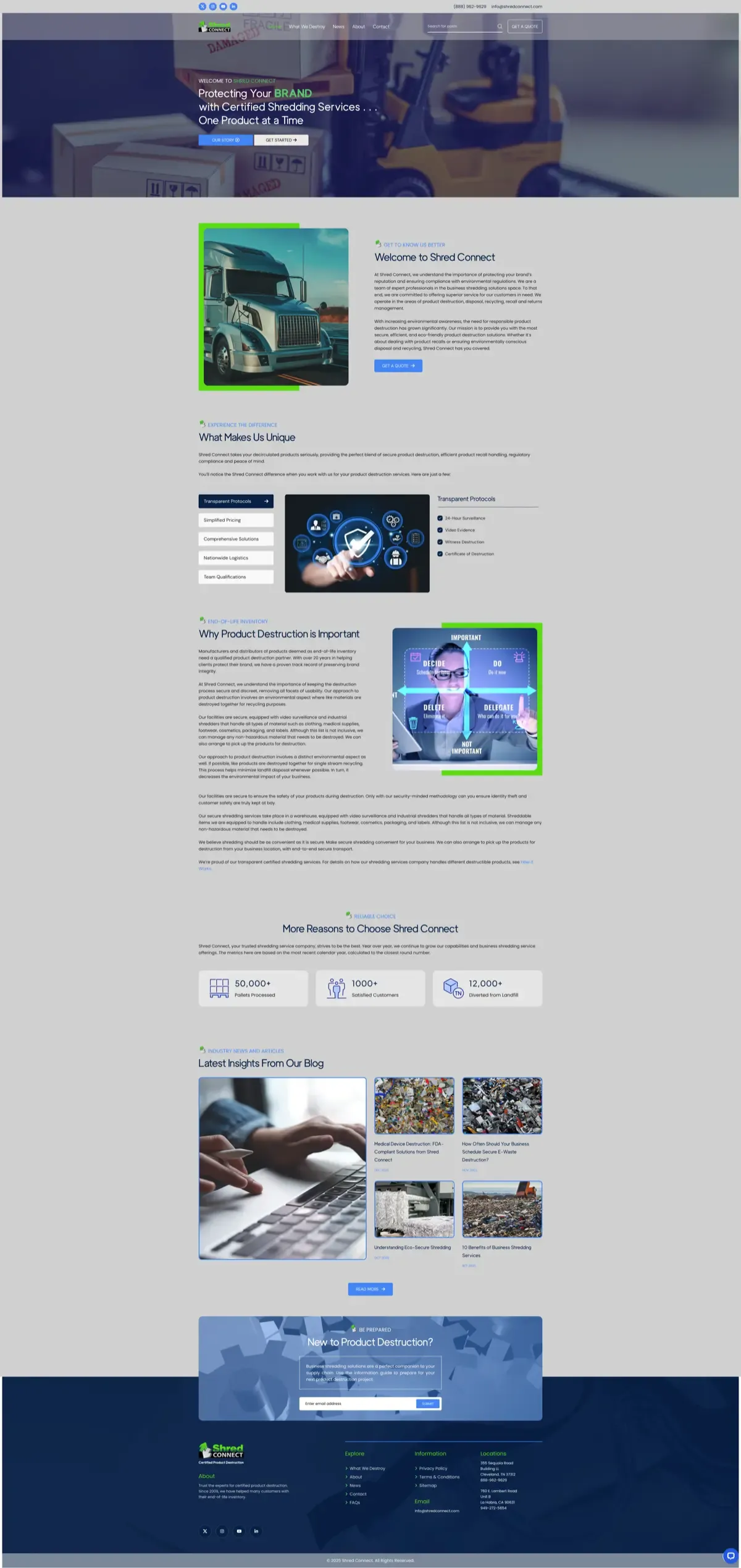 Homepage design: hero with brand messaging, tabbed differentiators, process explanation, and social proof.
The homepage moves through a deliberate sequence: hero with brand promise, company introduction, tabbed differentiators (Transparent Protocols, Simplified Pricing, Comprehensive Solutions, Nationwide Logistics, Team Qualifications), process explanation, metrics bar (50,000+ pallets processed, 1,000+ satisfied customers, 12,000+ diverted from landfill), blog feed, and email capture.
The tabbed section on the homepage is the core differentiator block. Instead of listing features in a wall of text, each selling point gets its own tab with a supporting image and bullet points. Visitors can self-select what matters most to them.
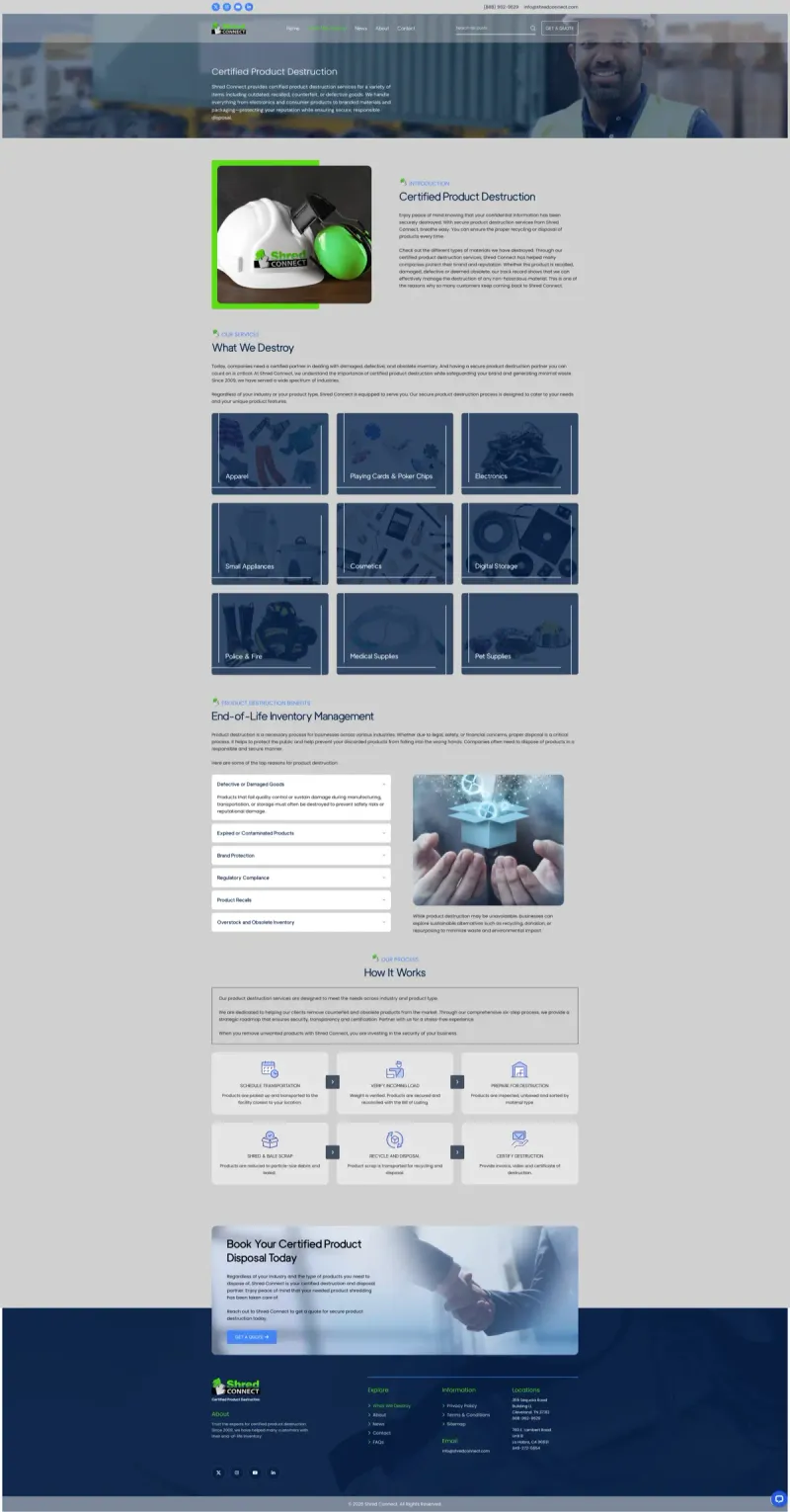
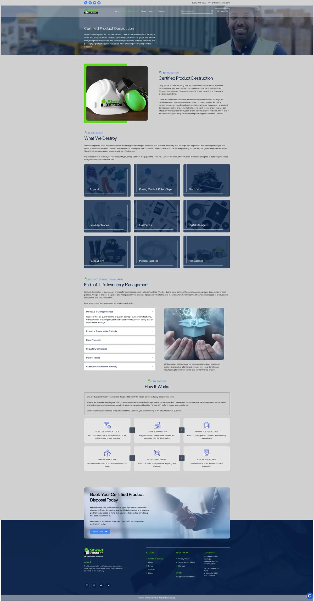
Services Page: Visual Product Taxonomy
 What We Destroy page: 9 categories with image cards, accordion for benefits, and 6-step process flow.
Nine product categories (Apparel, Playing Cards & Poker Chips, Electronics, Small Appliances, Cosmetics, Digital Storage, Police & Fire, Medical Supplies, Pet Supplies) are presented as image cards in a 3-column grid. Each card uses a consistent hover treatment with a dark overlay and category name.
Below the grid, an accordion section covers the reasons for product destruction (Defective Goods, Expired Products, Brand Protection, Regulatory Compliance, Product Recalls, Overstock). Then a 6-step process flow walks visitors through the full destruction lifecycle: Schedule Transportation, Verify Incoming Load, Prepare for Destruction, Shred & Bale Scrap, Recycle and Disposal, Certify Destruction.
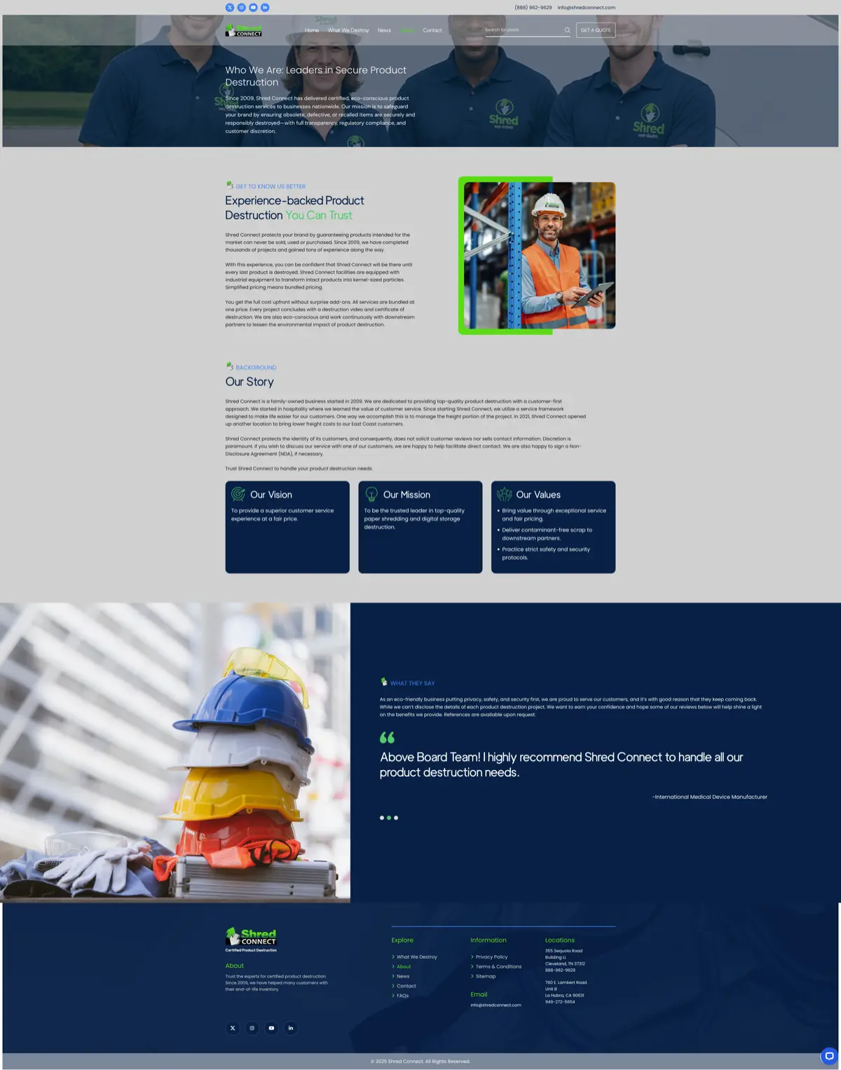
About Page: Story and Social Proof
 About page: company background, vision/mission/values trio, and testimonial section.
The about page establishes ShredConnect’s history (family-owned since 2009, started in hospitality, expanded to a second location in 2021). Three cards present Vision, Mission, and Values in a scannable format. A full-width testimonial section with team photography provides social proof from an “International Medical Device Manufacturer.”
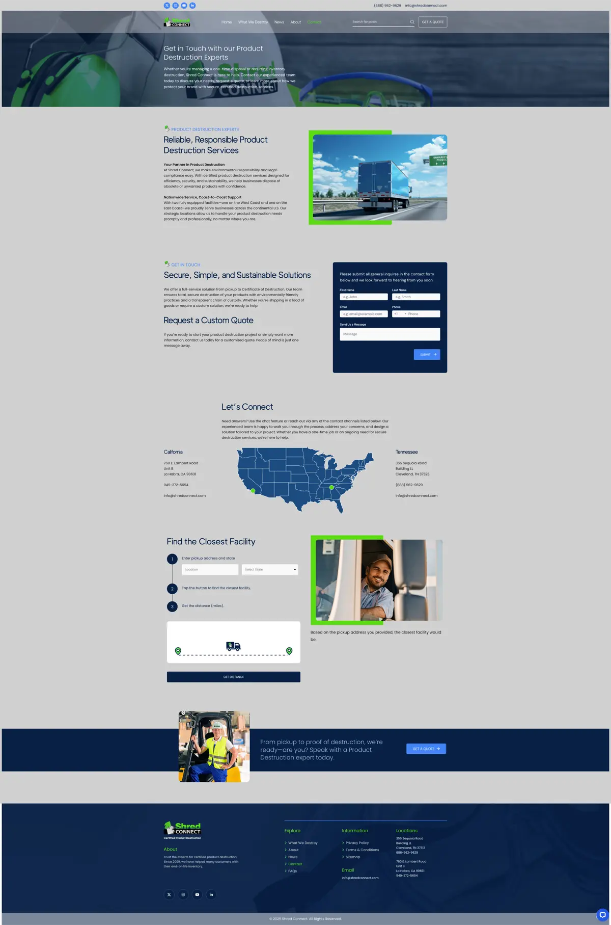
Contact Page: Dual Location + Facility Finder
 Contact page: form, dual-location display with interactive map, and facility distance finder.
The contact page is where the multi-location challenge gets solved. A contact form sits at the top for immediate conversions. Below that, both facilities display side by side with addresses and phone numbers, anchored by an interactive US map showing both locations.
The facility finder tool lets visitors enter their pickup address and state, then calculates the distance to the nearest facility. For a nationwide service where transportation logistics matter, this feature directly addresses the “which facility should I use?” question before it becomes a barrier.
The Result
Four pages. Dark, industrial, on-brand. The design gives ShredConnect a digital presence that matches the seriousness of certified product destruction while keeping the information architecture clean enough for first-time visitors to understand the service.
The facility finder on the contact page is probably the most functional design element. For a business where physical proximity to a shredding facility determines shipping costs and logistics, giving visitors an instant distance calculation removes friction from the quote request process.
eSEO Space handled development and everything beyond the UI. The collaboration was straightforward: I delivered the visual design, they built and optimized it.


About Industrial Website Design
Frequently Asked Questions
A dark palette communicates authority, security, and seriousness. For industries where trust and compliance are paramount (product destruction, security services, industrial manufacturing), a dark aesthetic reinforces the gravity of the work. It also creates strong contrast for CTAs and key information, making the important elements pop.
The key is presenting both locations as equally capable without forcing visitors to choose too early. For ShredConnect, the contact page displays both facilities side by side with an interactive map and a facility finder tool. This lets visitors self-select based on proximity rather than guessing which location serves their area.
Specialization. The designer focuses entirely on visual strategy, information architecture, and user experience without worrying about technical constraints during the creative phase. The development team then builds exactly what was designed, optimized for performance and SEO. It's two teams doing what they do best instead of one team splitting focus.
Visual taxonomy. For ShredConnect's 9 product destruction categories, I used a 3-column image card grid where each category gets equal visual weight. This prevents the page from becoming a wall of text while letting visitors quickly scan for their specific product type. An accordion section below handles the detailed information.
Not Ready Yet?
No pressure. Here’s how to tell when your industrial service business needs a website refresh.
Signs your website is working against you:
- Potential clients call with basic questions your website should answer
- Your online presence doesn’t match the professionalism of your actual operation
- You have multiple locations but the website treats one as an afterthought
- Visitors can’t quickly find their specific service need in your offerings
- Your competitors’ websites look more trustworthy than yours
When the timing is right:
I work with eSEO Space on website design projects for industrial and B2B service companies. If your website needs to communicate trust, organize complex service offerings, or present multiple locations clearly, that’s the kind of design challenge I enjoy solving.
Project Gallery


Case study by
Kristian Kreaktive
Founder & Lead Strategist at Digital Marketing Services
17+ years of experience helping small businesses grow their online presence through strategic SEO, web design, and branding.
In collaboration with
eSEO Space
UI Design
I handled the website UI design for ShredConnect. eSEO Space managed development, SEO, content strategy, and ongoing marketing.
Learn more about our partnershipMore Web Design Success Stories
Bot Image AI: Zero to 158 Keywords for FDA-Cleared Tech
158 organic keywords with #1 positions for ProstatID and core brand terms
Ladies of Liberty: A Redesign That Matched the Mission's Energy
249 organic keywords and #1 rankings for core brand terms plus top-5 positions for high-search-volume speaker names
Website Design and Local SEO for Truck Repair in Sacramento, CA
0 to 31 organic keywords with multi-location visibility across Sacramento metro