


On this page
TL;DR
Pegria is a cybersecurity consulting and managed security firm in Los Angeles. They had no logo, no business cards, and no visual identity at all, which is a serious problem in an industry where credibility is everything. I built their complete brand identity in 3 weeks: a navigation-inspired compass-globe logo, custom typography, a kinetic visual system with neon data-in-motion light trails, and a full collateral suite ready for print and digital. Pegria went from zero brand to enterprise-ready, able to walk into client pitches looking like an established firm instead of a startup.
Pegria is a cybersecurity firm in Los Angeles that offers both consulting and managed security services. They help organizations build security programs from scratch, then monitor those systems around the clock. Advisory on one side, operational defense on the other.
When they came to me, they had neither a logo nor a business card. Just a name, a service offering, and the need to look credible in front of enterprise prospects.
The Challenge: Starting a Cybersecurity Firm With No Brand
Cybersecurity is one of those industries where first impressions carry disproportionate weight. A company that protects sensitive data, monitors network threats, and advises executives on risk cannot afford to look amateur. One bad impression and the conversation ends before it starts.
Pegria had a harder version of this problem. They were new. No track record to lean on, no client logos to display, no portfolio of past work. The only thing they could control was how they presented themselves.
And the market they were entering is visually monotonous. Cybersecurity branding tends to fall into two camps: either the dark-background-with-shield-icon look (trustworthy but forgettable) or the neon-green-on-black “hacker aesthetic” (attention-grabbing but not enterprise-appropriate).
Pegria needed a third option. Something that communicated technical depth and global capability without defaulting to the same visual cliches their competitors were using.
The Concept: Navigation as a Security Metaphor
The core idea came from an unexpected place: astrolabes.
Astrolabes are ancient navigation instruments. Sailors and astronomers used them for centuries to determine position, predict celestial events, and find their way. They’re precision tools built for navigating complex, high-stakes environments.
That parallel to cybersecurity felt too natural to ignore.
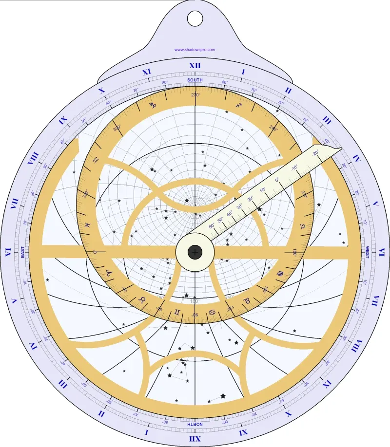 The planispheric astrolabe: centuries-old precision navigation. The conceptual ancestor of Pegria’s brand identity.
I developed a compass-globe logo that builds on this metaphor. The compass rose represents direction and guidance: “we navigate you through the threat landscape.” The wireframe globe communicates global reach and the interconnected nature of modern cyber threats. Together, they position Pegria as a firm that guides organizations through complexity, not just a vendor that sells security tools.
![]() The complete logo: compass-globe icon paired with the custom PEGRIA wordmark. “Cyber Security” anchors the positioning.
The complete logo: compass-globe icon paired with the custom PEGRIA wordmark. “Cyber Security” anchors the positioning.
The wordmark itself uses a custom-modified geometric typeface. The defining feature is the angled “A” at the end of PEGRIA, which echoes the directional point of a compass needle. It’s a small detail that reinforces the navigation theme without being obvious about it.
What I Built
The Color System
Deep navy blue paired with purple and violet. This is a deliberate departure from the cybersecurity default palette.
Most cyber firms land on one of two color strategies: electric blue (safe, corporate, instantly forgettable) or black and green (the “Matrix” look, which reads as tactical rather than strategic). Navy blue gives Pegria the depth and authority the industry expects, while purple adds intelligence and sophistication. The combination signals that this is a firm that thinks, not just a firm that reacts.
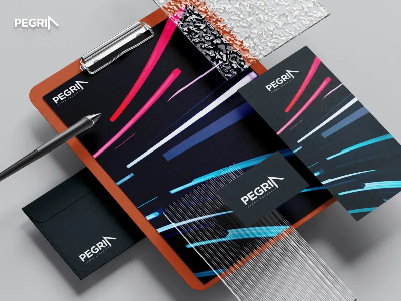
The Visual Language: Data in Motion
The most distinctive element of Pegria’s brand system is the visual language I built for their collateral: dynamic neon light streaks (hot pink, cyan, white) sweeping across dark backgrounds.
These aren’t decorative. They represent data in motion. Network traffic, data packets, information flowing between systems. When you’re a managed security provider, your entire job is watching the movement of data and catching threats in transit. The visual system makes that concept tangible.
The contrast between the dark backgrounds and the vivid light trails also creates an immediate visual distinction. In a sea of static, corporate cyber brands, Pegria’s collateral has kinetic energy. It feels active, which is exactly what 24/7 security monitoring should feel like.
App Icon and Digital Applications
The compass-globe icon was designed to work at any size, from a building sign to a 60x60 pixel app icon. I tested it in context against Apple’s own design language on both iOS and macOS, and it holds up. The globe’s wireframe lines remain legible even at small sizes, and the purple-to-navy gradient gives it depth without clutter.
Physical Presence
The building signage mockup shows how the brand translates to physical environments. White logo on dark material creates clean contrast that’s readable from a distance. For a cybersecurity firm that might host enterprise clients on-site for assessments or briefings, that first physical impression matters.
The Result
Three weeks from kickoff to final delivery. That’s fast for a complete brand identity, and it happened because the client was decisive and the concept clicked early.
Here’s what Pegria walked away with: a logo system (compass-globe icon plus custom wordmark), a complete color and typography specification, a visual language system (the data-in-motion neon treatment), and a full collateral suite ready for print production.
The brand does three things a new company needs:
It establishes credibility immediately. When Pegria shows up to a pitch with professionally designed collateral, the “new company” disadvantage disappears. The prospect evaluates the proposal, not the brand’s age.
It differentiates in a generic market. The navigation metaphor, the compass-globe, the neon light trails: none of these are standard cybersecurity visual language. Pegria’s brand doesn’t look like it was pulled from a template library.
It scales across contexts. The same identity system works on a building sign, a business card, a pitch deck, and a 60-pixel app icon. Pegria doesn’t need a separate design for each medium. The system was built to translate.
About This Project
Frequently Asked Questions
You can get a logo by itself. But a logo without a color system, typography, and usage guidelines will look different every time someone applies it. Business cards won't match your website. Your pitch deck will feel disconnected from your signage. A full brand identity is the system that keeps everything consistent. For Pegria, the logo was one piece. The color palette, the data-in-motion visual language, and the collateral templates are what made the brand actually usable across every situation they'd encounter.
It removes a reason to say no. When a prospect evaluates two companies with similar offerings and one looks polished while the other looks thrown together, the polished one gets the meeting. Branding doesn't close deals by itself, but it eliminates the credibility gap that kills deals before they start. For a brand-new company like Pegria, professional collateral turns 'I've never heard of them' into 'they look like they know what they're doing.' That shift is worth more than any ad campaign.
It depends on the client. Pegria was decisive. They gave clear feedback, made quick decisions, and didn't second-guess direction once we aligned on the concept. That's what makes a project move fast. Most brand identity projects take 4 to 6 weeks. Some take 8 or more if there are multiple stakeholders, lots of revision rounds, or uncertainty about the direction. The timeline is less about the design work and more about how quickly decisions get made.
Everything you need to show up professionally in any context. For Pegria, that included: the logo in every format needed for print and digital, a brand color specification with exact color codes, typography guidelines, the visual language system (the neon light trail treatment with templates), and print-ready files for business cards, stationery, folders, and signage. You shouldn't need to hire another designer just to use what I deliver.
The approach works for any business where trust matters before the first conversation. The specifics change completely. A cybersecurity firm gets a navigation metaphor with neon data trails. A law firm would get something entirely different. A restaurant, different again. What stays the same is the process: understand what your business actually does, figure out what your prospects need to believe about you, and build a visual system that communicates those things before you say a word.
When your brand is costing you opportunities. If prospects underestimate you based on how you look, if you avoid handing out business cards, if your marketing materials feel inconsistent or cobbled together, those are signals. The other signal is growth: if you're about to pitch bigger clients, enter a new market, or hire a team, having a professional brand system in place before those moments saves you from doing it under pressure later.
Not Ready Yet?
No pressure. Here’s how to figure out whether professional branding is the right move for your business right now.
Warning signs your brand is working against you:
- Prospects seem surprised when they meet you in person because your materials don’t match your expertise
- You’ve been using a logo you made yourself (or got for $50 online) and it shows
- Every piece of marketing you produce looks slightly different because there’s no system
- You’re competing against companies with less experience but more polished brands
- You hesitate to send your website link or hand someone a business card
Questions to answer before we talk:
- What’s the gap between how good your business actually is and how it looks to strangers?
- Are you losing opportunities because prospects don’t take you seriously at first glance?
- Do you need a full brand system, or just a logo refresh?
When you’re ready:
I’m happy to take an honest look at whether a branding project makes sense for your situation. Some businesses need a complete identity built from scratch. Others just need to clean up what they already have. I’ll tell you which, and I won’t oversell it.
Project Gallery


Case study by
Kristian Kreaktive
Founder & Lead Strategist at Digital Marketing Services
Ranked #1 freelance web designer by Clutch. 17+ years building websites and SEO strategies that bring real results for small businesses.
In collaboration with
eSEO Space
Design & Development
This project was created in collaboration with eSEO Space, combining our strategic approach with their technical expertise to deliver exceptional results.
Learn more about our partnershipMore Digital Marketing Clients from Los Angeles
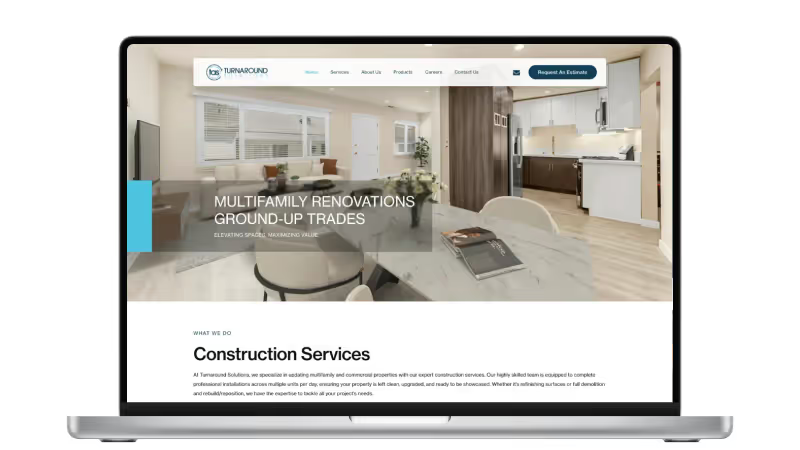
Website Design for Multifamily Renovation Contractor in Gardena
Professional B2B digital presence for a contractor with $1B+ in property acquisitions
Website Redesign That Turns a Product Catalog Into a Lead Engine
240+ organic keywords with multiple #1 rankings, rebuilt from a 91-visit algorithm crash
More Branding Success Stories
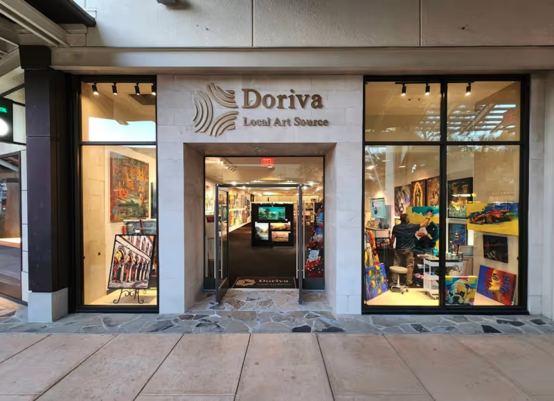
Brand Identity for a San Antonio Art Marketplace
From zero brand to 250+ organic keywords and #1 rankings for San Antonio art searches
When the Logo Tells the Whole Story: Clean Cut Renovations
One logo concept that expanded into a complete brand identity and custom website
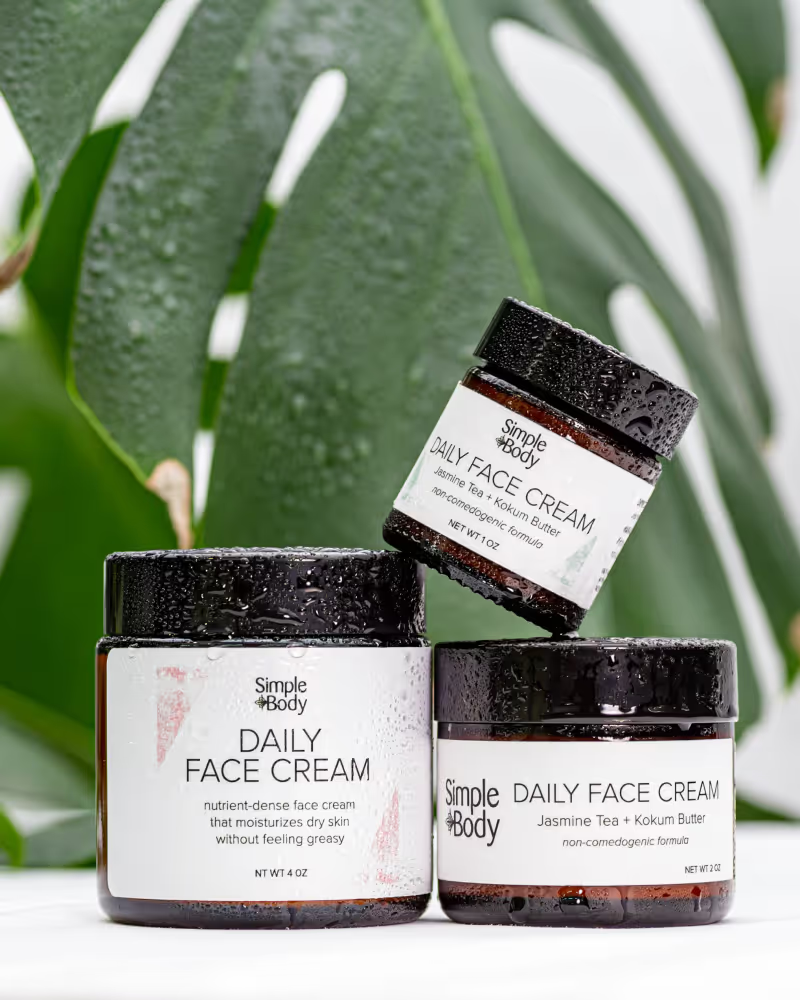
Product Photography for Simple Body: 2,500+ Images Across 16 Months of Seasonal Campaigns
2,500+ professional images across 75+ products and 16 months of seasonal campaigns