


On this page
TL;DR
Olivia is a high-end fashion boutique in Bilbao’s Casco Viejo district, carrying their own label alongside curated designer pieces. Their logo was set in Arial, and nothing about the brand matched the premium products on the racks. I designed a custom serif wordmark, a copper and gold foil visual identity system, and storefront signage that shifted the entire customer perception. The result: customers now walk in expecting premium prices, and they pay them.
A DIY Logo Was Holding Back a Luxury Boutique
Olivia is a high-end fashion boutique in Bilbao’s Casco Viejo, the old quarter where narrow cobblestone streets meet curated shopping. They carry a mix of their own label pieces alongside hand-picked selections from established designers.
The products were premium. The brand was not.
Their logo was set in Arial. Clean, sure. But for a store where customers are browsing silk blouses and structured blazers, Arial signals something closer to a bank form than a luxury shopping experience.
Nothing was wrong with the logo for getting started. Every business tests the waters before investing. But Olivia had outgrown that phase. The store interior, the product selection, the clientele all said one thing. The brand said something else entirely.
The Numbers That Matter
| What We Delivered | The Detail |
|---|---|
| Market | Bilbao, Basque Country (Casco Viejo district) |
| Product Mix | Own label + curated designer fashion |
| Brand Assets | Custom wordmark, visual identity system, storefront signage |
| Before State | Arial logo, no cohesive visual identity |
| After State | Luxury-positioned brand with copper and gold foil system |
Works Well For: Is This Case Study Relevant to You?
This case study is most relevant if you:
- Your brand looks cheaper than your product. You’ve invested in quality inventory or services, but the visual identity hasn’t caught up.
- You’re competing in a local market with a strong sense of style. Whether that’s Bilbao, Denver, or Portland, location-aware branding matters.
- You’ve outgrown the DIY phase. The logo you started with served its purpose. Now it’s time for something that matches where you’re headed.
- Your price point and your brand presentation don’t align. Customers should arrive expecting your actual pricing, not be surprised by it.
Industry fit:
- Retail boutiques and specialty stores
- Fashion and luxury goods
- Any physical retail where in-store experience matters
- Businesses where brand perception directly affects pricing power
The Problem: Premium Products, Generic Brand
Here’s what Olivia was dealing with. The store carried beautiful products, curated with real taste, in one of Bilbao’s most charming shopping districts. But the brand identity told a completely different story.
The logo was DIY. Arial with no custom treatment. It communicated nothing about the quality of what was inside. For a store selling premium fashion, the first impression was working against them.
No visual system existed. There was no color story, no typography hierarchy, no consistent brand language across touchpoints. Every piece of collateral felt disconnected from the shopping experience.
Price perception was capped. This is the quiet damage a weak brand does. When your visual identity signals mid-market, customers walk in with mid-market expectations. They’re surprised by the actual price point instead of expecting it. That gap costs you sales.
The Insight: European Restraint
There’s a difference between American luxury branding and European luxury branding. American luxury tends to announce itself. European luxury tends to assume you already know.
For Olivia, I leaned into that European sensibility. The logo doesn’t need a tagline. The color palette doesn’t need six colors. The storefront signage doesn’t need a graphic or icon. The name, set properly, does all the work.
This approach works specifically because of where Olivia sits. Casco Viejo attracts people who appreciate craftsmanship and authenticity. The kind of shopper who notices typeface choices and paper weight. The brand had to speak to that sensibility without overexplaining itself.
What I Actually Built
The brief was clear: a visual identity that matches the quality of what’s inside the store.
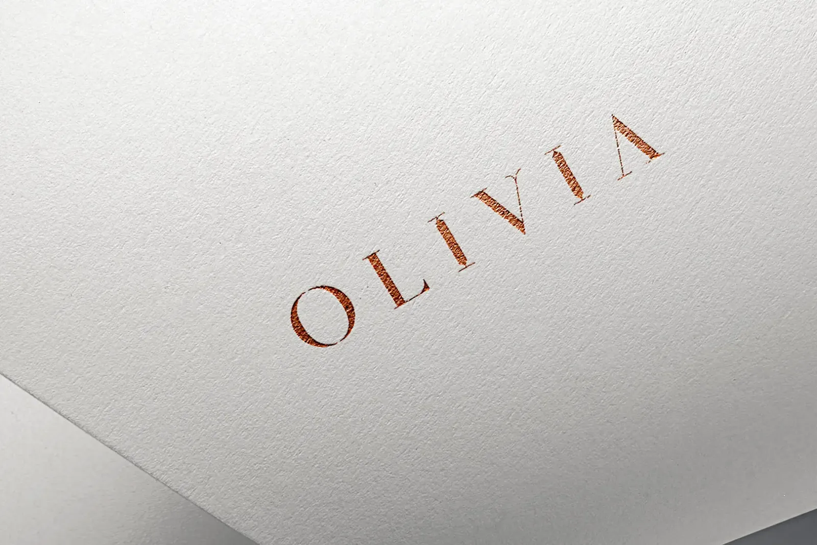
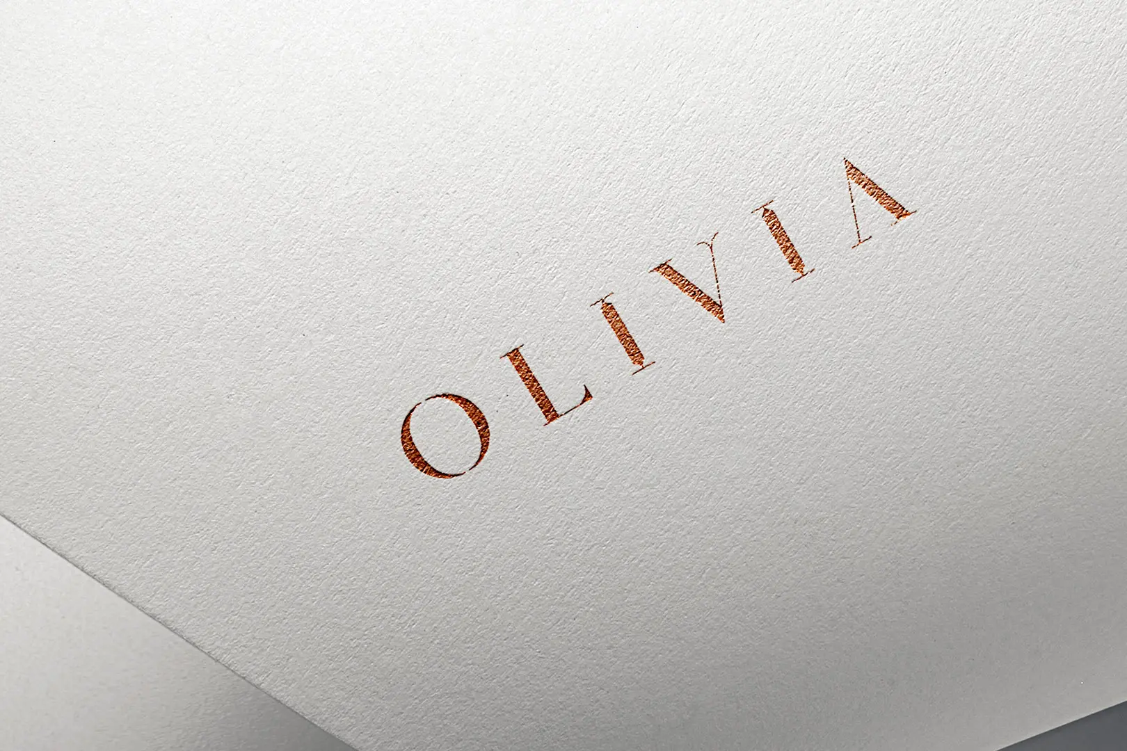
The Logo: A Custom Serif Wordmark
The new wordmark uses a custom serif with generous letter-spacing. Each character is balanced to feel architectural, almost like it was carved rather than typed. The “O” has a subtle weight distribution that keeps it from feeling static, while the “V” features a refined geometric structure that distinguishes it from standard typefaces.
This is the kind of logo that looks as good foil-stamped on cotton paper as it does etched into glass.
![]() Copper foil on cotton paper. The kind of detail that signals quality before a customer reads a word.
Copper foil on cotton paper. The kind of detail that signals quality before a customer reads a word.
Visual Identity System
The palette draws from two finishes: copper foil for print and intimate touchpoints, gold for environmental and storefront applications. Both communicate permanence and refinement without the cold distance that platinum or silver can create.
The typography system carries the same restraint. Wide tracking. Deliberate white space. Nothing competes for attention because confidence doesn’t need to be loud.
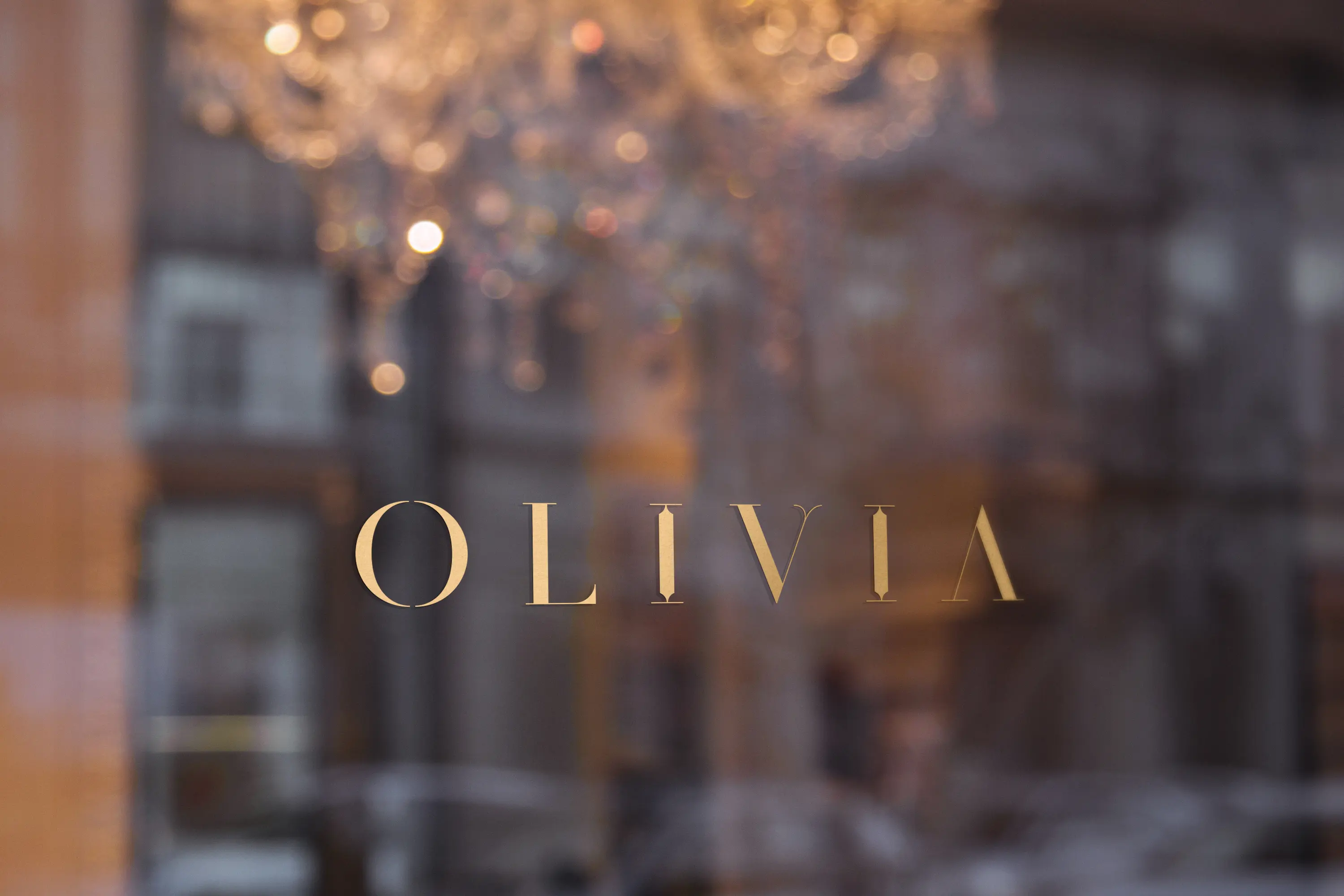
Storefront Signage
The gold wordmark on Olivia’s storefront glass creates a specific first impression. Through the lettering, you catch the crystal chandelier inside. It’s a single visual that tells the entire brand story: this is a place where details matter.
 Gold on glass. The chandelier visible through the lettering was not accidental.
The Result: Shifted Price Expectations
The result on this project is my favorite: “Customers now expect to pay more, and they do.”
That’s what proper brand positioning does. Before the rebrand, the store’s visual identity was creating a price ceiling that didn’t match the product quality. Customers walked in with mid-market expectations.
After the rebrand, the expectation shifted before anyone touched a garment. The storefront, the shopping bags, the brand collateral all signal a price point. Customers arrive prepared to invest, and the products deliver on that expectation.
A well-executed brand identity doesn’t just look better on Instagram. It reframes the entire customer relationship.
Not Ready Yet?
That’s fine. Here’s how to know when branding becomes a priority.
Signs you need brand help:
- Customers are surprised by your prices (in either direction)
- Your store interior or product quality doesn’t match your visual identity
- You’re losing to competitors who aren’t necessarily better, just better presented
- You’ve been using the same DIY logo since you opened
- You’re embarrassed to hand out your business card
Questions to answer before we talk:
- What do customers expect when they see your brand for the first time?
- Does that expectation match what you actually deliver?
- Is your visual identity helping or hurting your pricing power?
- Are you competing on quality or competing on price, and is that by choice?
When the timing is right:
I offer a free brand consultation. No obligation, no pressure. Just an honest look at whether branding investment makes sense for your specific situation.
Some businesses don’t need a rebrand. They need better marketing with what they have. I’ll tell you that.
But if your brand is actively holding you back from the prices your products deserve, a conversation will clarify what fixing it would look like.
Project Gallery
Case study by
Kristian Kreaktive
Founder & Lead Strategist at Digital Marketing Services
Ranked #1 freelance web designer by Clutch. 17+ years building websites and SEO strategies that bring real results for small businesses.
More Digital Marketing Clients from Bilbao
How 50 Monthly Searches Turned Into a Fully Booked Consulting Business
From zero online presence to fully booked in 6 months, zero ad spend
Brand Identity and Editorial Photography for a Debut Bridal Collection
First collection went to market with a brand identity and editorial portfolio ready for press
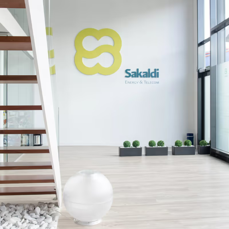
Brand Identity System & Logo Creation for Energy & Telecom Firm in Bilbao
New identity system that opened doors to larger enterprise energy contracts
More Branding Success Stories
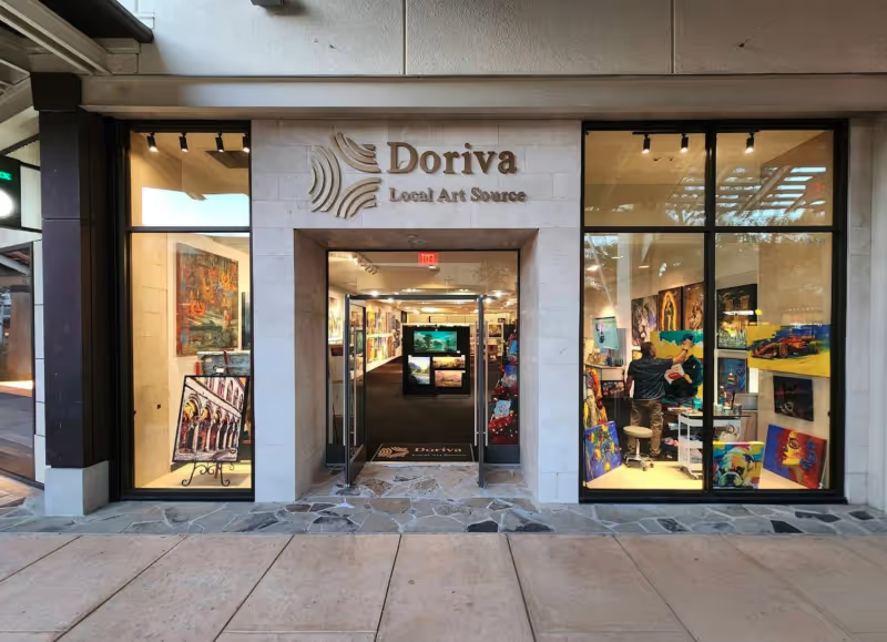
Brand Identity for a San Antonio Art Marketplace
From zero brand to 250+ organic keywords and #1 rankings for San Antonio art searches
When the Logo Tells the Whole Story: Clean Cut Renovations
One logo concept that expanded into a complete brand identity and custom website
Product Photography for Simple Body: 2,500+ Images Across 16 Months of Seasonal Campaigns
2,500+ professional images across 75+ products and 16 months of seasonal campaigns