


On this page
A guy spends 20 years in corporate sales. One night at a friend’s party, he watches local artists display and sell their work. He goes home, spends an hour searching for a place to buy local art online in San Antonio. Finds nothing. Starts a business the next morning.
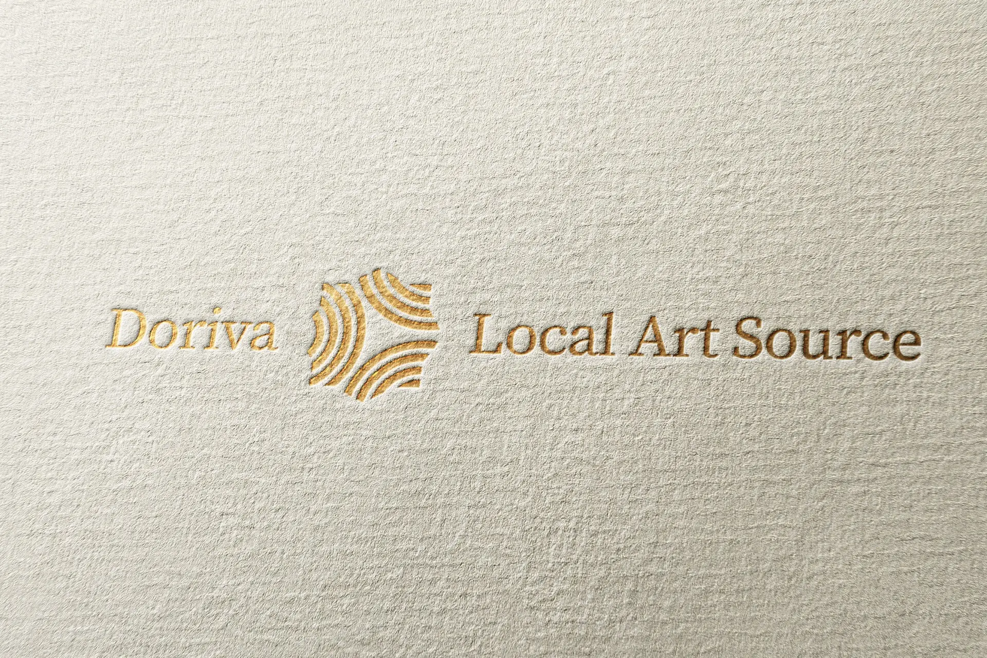
That is the kind of founder I want to work with. Someone who sees a gap, has the conviction to fill it, and just needs the visual identity to match the ambition. I built the entire brand identity for Doriva Local Art Source from scratch: logo, icon, color system, typography, and physical applications. eSEO Space built the website and handled the SEO.
The combined result? The gallery is open, the online marketplace is live, and the site now ranks for over 250 organic keywords, including #1 for the most valuable local art search terms in San Antonio.
The Numbers That Matter
| Metric | Result |
|---|---|
| Organic Keywords Ranking | 250+ |
| #1 Rankings | ”san antonio artists collective,” “san antonio artist collective” |
| Top 5 Rankings | ”local art” (720 monthly searches), “san antonio texas artists” (140 monthly searches) |
| Page 1 Rankings | ”local artist near me” (1,000 monthly searches), “local artwork” (480 monthly searches) |
| Brand Investment | $5K-$10K |
| Brand Timeline | 4 weeks from discovery to delivery |
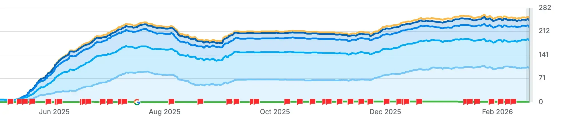 Organic keyword growth from launch to present. The brand and website launched in Q2 2025. By February 2026, the site ranks for 250+ keywords with steady upward trajectory.
Works Well For: Is This Case Study Relevant to You?
This case study is most relevant if you:
- You sell something people connect with emotionally (art, handmade goods, curated collections) and your brand needs to match that feeling
- You have a physical location and an online store and the brand needs to work in both places without feeling like two different businesses
- You are building toward something bigger (franchising, multiple locations, licensing) and need a brand that can scale beyond the first storefront
- You had success with the product but the visual identity never caught up to where the business actually is
Industry fit:
- Art galleries, studios, and creative marketplaces
- E-commerce businesses with physical retail presence
- Franchise-ready brands needing a scalable identity system
- Any business where the first impression determines whether people walk in
The Problem: A Real Business With No Brand
Here is what the founder already had: a physical gallery in San Antonio filled with thousands of original, hand-painted artworks by local artists. No prints. No reproductions. Every single piece is one of a kind, created by someone living in the community. He had built the business model, recruited the artists, secured the retail space, and started making sales.
Here is what he did not have: a logo. A color palette. A visual identity that could carry any of that weight. And he was not just building a gallery. He was building a franchise model. The brand needed to work on a storefront in San Antonio today and on a franchise pitch deck in a different city tomorrow.
The gap was obvious. A gallery that sells original art cannot present itself with a generic identity. The people walking by need a reason to walk in. The people browsing online need a reason to trust. And future franchisees need to believe the brand is worth investing in.
The Concept: Ripples From a Single Point
The founder had a clear vision for what the brand should mean. He told me early in discovery: “I want it to represent the ripple effect art has in a community.”
That is not a vague creative brief. That is a concept I can build on.
An artist paints something. A buyer connects with it. That purchase supports the artist, who creates more. The community gets richer. One piece of art sends waves outward. The concept was right there in how the business actually works.
I designed a custom icon built from concentric curved lines radiating outward from a central point. Each set of lines represents a wave. The overall form creates an organic, layered shape that feels like motion captured mid-ripple. Abstract enough to work at any scale, meaningful enough to reward a second look.
![]() The ripple mark: concentric waves radiating from a single point. Each curve represents art’s expanding impact on a community.
The ripple mark: concentric waves radiating from a single point. Each curve represents art’s expanding impact on a community.
The gold color was the client’s choice from day one. He knew what the brand should feel like before I started designing. Warmth. Authenticity. A sense of value that matches the original artwork on the walls. When a client has that kind of clarity about their own brand, the designer’s job is to build around it. Gold became the anchor for every design decision that followed.
What I Built
The Logo System
The full logo uses a horizontal lockup: “Doriva” on the left, the ripple mark icon in the center, and “Local Art Source” on the right. The wordmark uses elegant, slightly formal typography that signals gallery-level presentation without feeling stiff.
The ripple mark works independently as a standalone element. On the storefront, it sits next to the full wordmark. On the floor mat, it pairs with the full name in gold on dark ground. On a favicon or social avatar, the icon carries the brand alone.
A franchise-ready brand cannot depend on a logo that only works in one configuration. It needs to scale, adapt, and still read as the same identity whether someone sees it on a building or a browser tab.
The Color System
Gold and warm amber tones define the primary palette. Not the flashy golds you see in luxury fashion or finance. Earthy, warm, and grounded. Think gallery lighting on a bronze frame, not a credit card commercial.
The palette translates without losing character. On cream-textured paper, the gold catches light. On the dark floor mat, it pops with warmth. On screen, the tones render as rich amber that avoids looking muddy.
![]() Color exploration during the brand process. Testing the mark across different palettes to make sure the system works beyond the primary gold.
Color exploration during the brand process. Testing the mark across different palettes to make sure the system works beyond the primary gold.
The Physical Space
The real test of any brand identity is what happens when it leaves the screen.
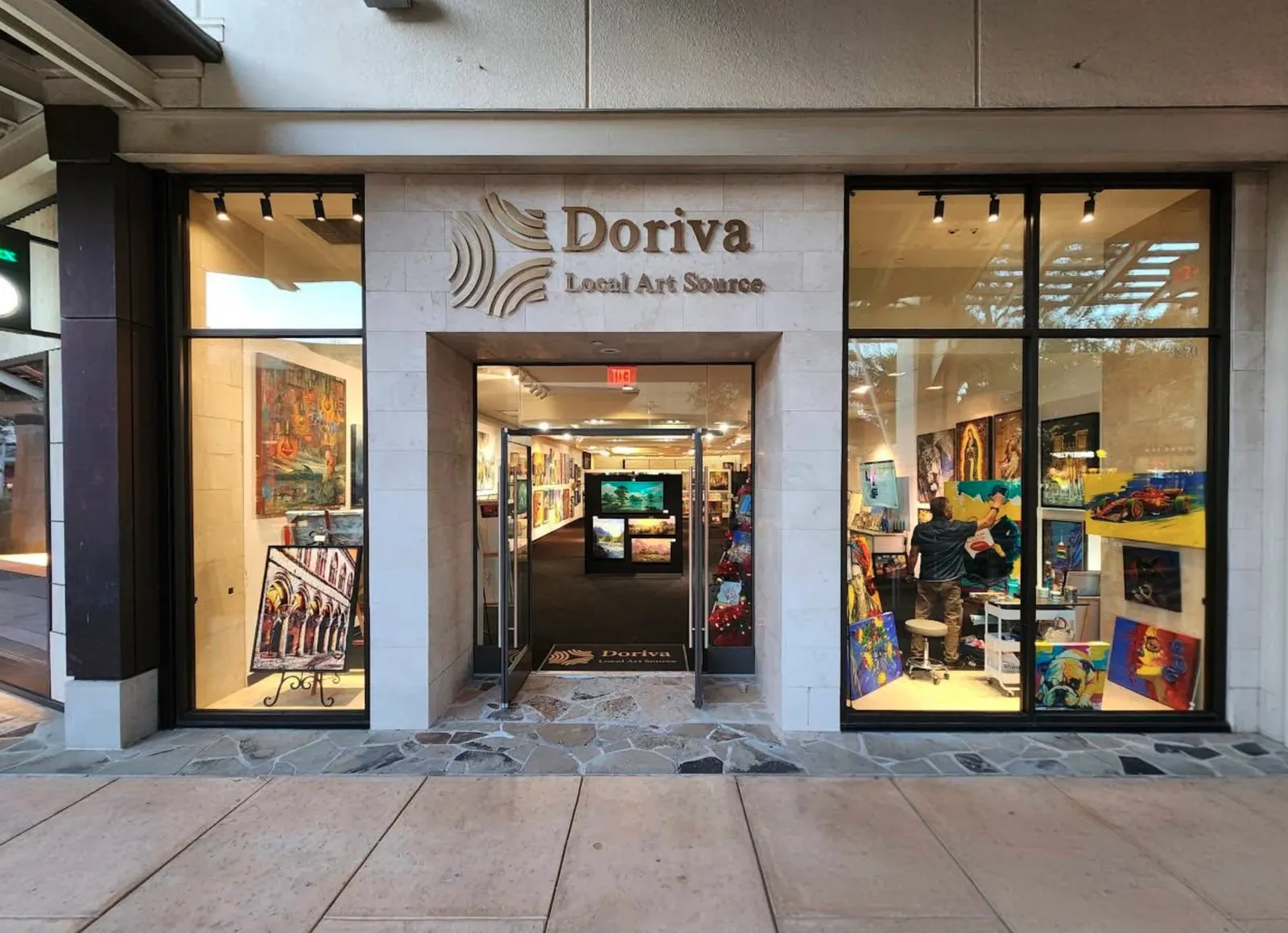
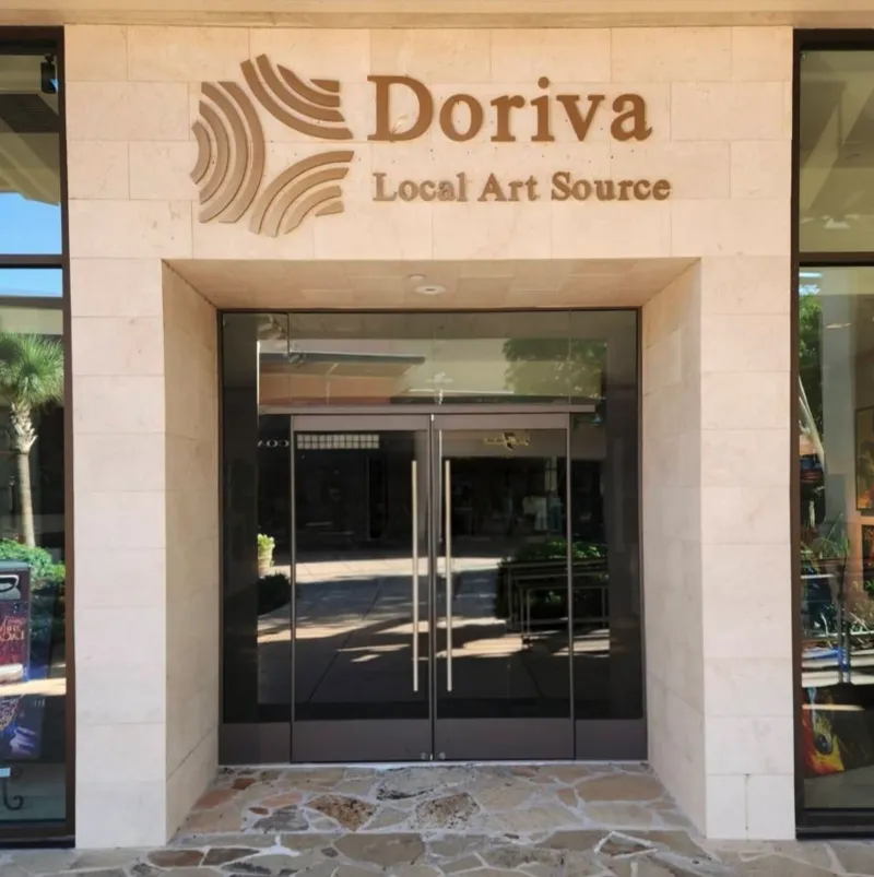
The storefront signage uses raised lettering on a stone facade. The Doriva wordmark and ripple icon sit above the entrance in warm brown tones. Raised dimensional lettering on natural stone communicates one thing: this gallery plans to be here for a long time.

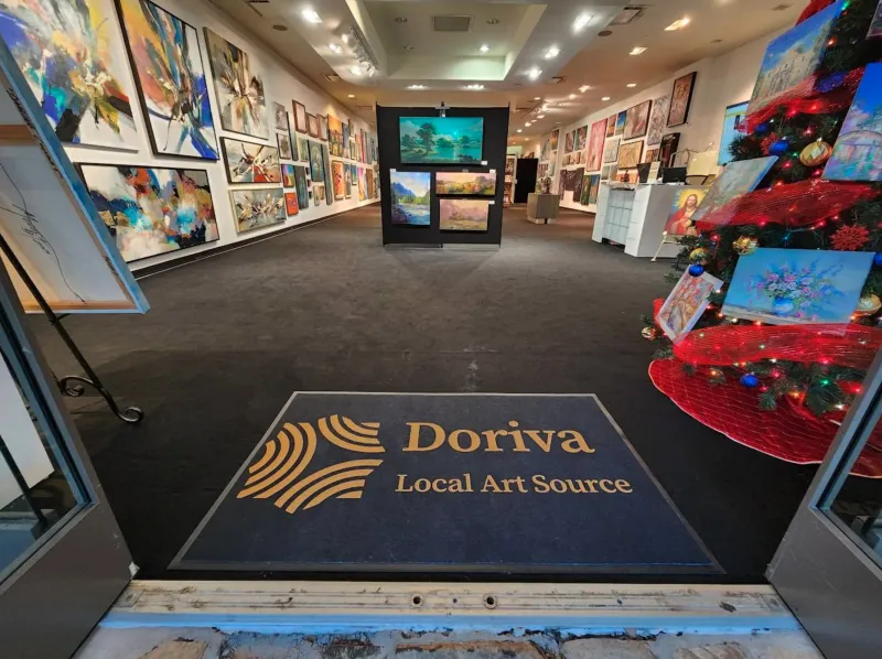
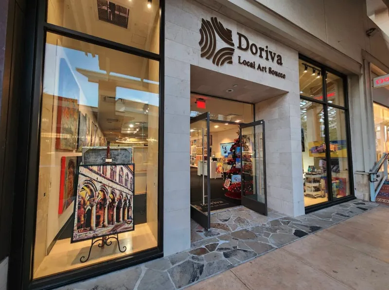
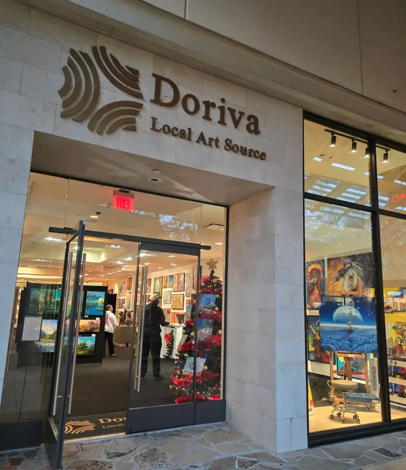
The branded floor mat at the entrance is the first thing visitors see when they walk in. Gold ripple icon and wordmark on dark ground, surrounded by walls of original artwork in every direction. The brand greets you, then the art takes over.
The Community
This part matters. Doriva is not just a storefront. It is a community of local artists who rent space, display their work, and connect directly with buyers. The founder built it to bridge a specific gap: talented San Antonio artists needed visibility, and art buyers needed a trusted place to find original work without driving to arts districts or scrolling through generic marketplaces.
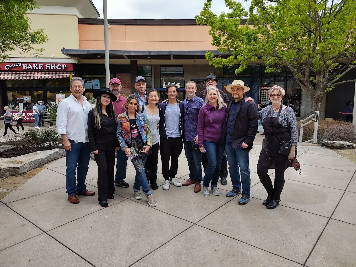 The Doriva Local Art Source community: local artists and team members outside the gallery. The brand represents every person in this photo.
The ripple mark is not just a pretty icon. It is about what happens when you support a local artist. The ripple moves outward: artist to buyer to community. That idea shaped the brand from concept to signage.
The Online Results
eSEO Space built the e-commerce website at localartsource.com and handled the SEO strategy. They translated the brand identity I designed into a fully functional online marketplace with the gold palette, the Doriva wordmark, and the ripple mark throughout.
The results speak for themselves. Within 8 months of launch, the site ranks for over 250 organic keywords in the US market:
- #1 for “san antonio artists collective” and “san antonio artist collective” (260 monthly searches each)
- #3 for “san antonio texas artists” (140 monthly searches) and “san antonio art for sale”
- #5 for “local art” (720 monthly searches)
- #7 for “local artist near me” (1,000 monthly searches) and “local artwork” (480 monthly searches)
- #10 for “independent art franchise” (50 monthly searches)
That last one matters. “Independent art franchise” ranking on page 1 means the site is already attracting the exact audience the founder needs for franchise expansion.
The brand identity and the website were built as two halves of the same system. I created the visual DNA. eSEO built the digital home for it. The organic growth is what happens when both pieces are done right and work together.
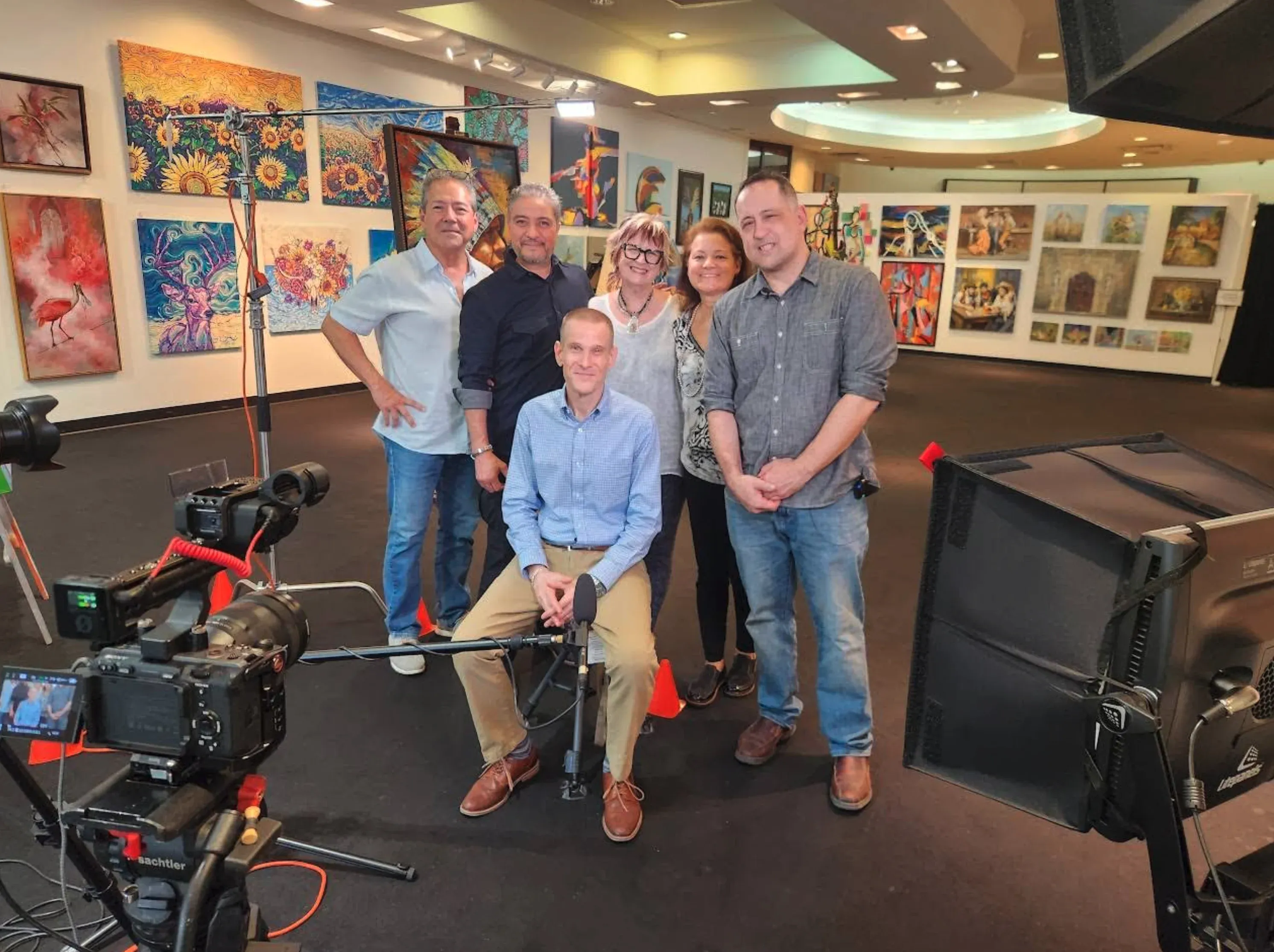 Inside the gallery during a professional video production. The walls tell the real story: hundreds of original paintings by local San Antonio artists.
The Result
Four weeks of brand work. Eight months of organic growth. Here is where Doriva stands today.
The brand matches the quality of the art on the walls. A gallery selling original, hand-painted artwork cannot present itself with a template logo. The ripple mark, the gold palette, and the raised signage all communicate the same care and intentionality the artists put into their work.
The numbers back it up. Over 250 organic keywords. #1 rankings for the most valuable local art search terms. Page 1 visibility for high-volume national terms like “local art” and “local artist near me.” The brand and website together built a digital presence that matches the physical one.
It scales for franchise growth. The founder is building toward a franchise model. The identity system is documented, reproducible, and already ranking for “independent art franchise.” A new franchisee in another city can deploy the brand without needing a redesign. The foundation is ready.
For a business that started because one person noticed a gap in the market, the brand and website now make sure that gap gets filled when anyone in San Antonio (or anywhere else) searches for local art.
About This Project
Frequently Asked Questions
This project fell in the $5,000 to $10,000 range, which included the full brand system: logo, icon, color palette, typography, and physical application specifications. Simpler projects (logo only, no physical applications) can cost less. More complex systems with packaging, extensive collateral, or multiple sub-brands cost more. I scope every project based on what you actually need, not a one-size-fits-all package.
This project took about 4 weeks from discovery to final delivery. That is on the faster end. Most brand identity projects take 4 to 6 weeks depending on how many revision rounds are involved and how quickly feedback comes back. The design work itself is not the bottleneck. Decision-making speed is. Clients who give clear, timely feedback get their brand faster.
Not directly, but it creates the foundation for everything that does. In this project, the brand identity gave the website its visual system, its color palette, its entire personality. When eSEO Space built the site and optimized it for search, the brand gave them something worth ranking. The result was 250+ organic keywords within 8 months. Strong branding makes every other marketing investment work harder because people trust what looks professional and click on what looks credible.
Yes, and franchise readiness was a core requirement for this project. A franchise-ready brand needs to be documented, reproducible, and flexible enough to work in multiple markets without losing its character. The logo needs to work at every size, the color system needs to translate across print and digital, and the whole system needs guidelines clear enough for someone else to apply it correctly.
Start with a logo and a color palette. Those two things give you enough to show up professionally on a website, a business card, and social media. You can build out the rest of the brand system as the business grows and the budget allows. A $2,000 to $3,000 starting point gets most small businesses a solid foundation. The key is making sure whatever you build first is designed to expand later.
For this project, I focused on the brand identity and my collaborator eSEO Space built the website and handled SEO. I also do web design for clients who need both, and I work with trusted partners when a project benefits from specialized expertise. Either way, the brand identity comes first. A website without a brand system behind it ends up looking inconsistent. The brand gives the website its visual DNA.
Not Ready Yet?
No pressure. Here is how to figure out whether professional branding makes sense for your business right now.
Signs your brand is not keeping up with your business:
- You have a great product or service but people underestimate you based on how you look
- Your online presence and your physical space feel like two different businesses
- You are planning to expand (new locations, franchising, partnerships) and the current brand was not built for that
- You avoid showing your logo or marketing materials because they do not represent where the business is today
- Competitors with less experience or worse products look more polished than you do
Questions to think through before we talk:
- What is the gap between how good your business actually is and how it looks to strangers?
- Is your brand holding you back from the next stage of growth (new market, franchise, partnership)?
- Do you need a full brand system, or just a logo to start with?
When the timing is right:
I am happy to take an honest look at your situation and tell you whether a branding project makes sense. Some businesses need a full identity built from scratch. Others just need a refresh. I will tell you which, and I will not oversell it.
Project Gallery

Case study by
Kristian Kreaktive
Founder & Lead Strategist at Digital Marketing Services
17+ years of experience helping small businesses grow their online presence through strategic SEO, web design, and branding.
In collaboration with
eSEO Space
Branding & Identity Design
I created the complete brand identity for Doriva Local Art Source. eSEO Space handled the e-commerce website build and search optimization.
Learn more about our partnershipMore Branding Success Stories
When the Logo Tells the Whole Story: Clean Cut Renovations
One logo concept that expanded into a complete brand identity and custom website

Product Photography for Simple Body: 2,500+ Images Across 16 Months of Seasonal Campaigns
2,500+ professional images across 75+ products and 16 months of seasonal campaigns
ALJLTY: A Cross Hidden Inside a T-Shirt Brand
Brand identity, 5-product apparel line, and e-commerce store launched in 12 weeks