


On this page
The letter T in ALJLTY is a cross. Most people don’t notice it the first time. That was the whole point.
Elizabeth and Brenton walked in with a name and a Bible verse. ALJLTY stands for “Always Let Jesus Live Through You.” Their nonprofit, Royale Ministry, runs on Mark 16:15: “Go into all the world and preach the gospel to the whole creation.” They wanted a brand identity that could carry that message on clothing people would actually wear. Not church merch. Real apparel.
Nothing existed yet. No logo, no colors, no products, no store. Just the acronym and the conviction behind it.
What Made This Hard
Faith-based apparel has a reputation problem. Most of it looks like it was designed in Word, printed on the cheapest blanks available, and sold from a folding table after service. Elizabeth and Brenton knew this. They wanted someone to pick up their shirt off a rack and think “that looks good” before reading a single word on it.
That’s a different design brief than “make us a Christian brand.” That’s “make us an apparel brand that happens to be Christian.” The distinction changes everything about how you approach the work.
They also needed the whole thing built. Logo, apparel line, packaging, e-commerce store. And the budget wasn’t limitless. This was a ministry-funded project in Colorado Springs, not a venture-backed startup.
How a Cross Ended Up Inside a Typeface
I went through three rounds of logo concepts before the obvious thing finally hit me. The first two rounds were fine. Clean wordmarks, a separate cross icon, traditional approaches. Elizabeth was polite about them. Brenton said “these are nice” in the way people say “these are nice” when they’re not excited.
Then I was staring at the letters A-L-J-L-T-Y on my screen and realized the T was already a cross. I just hadn’t drawn it that way yet.
Not a cross floating next to the wordmark. The cross is the T. Built into the structure of the word itself. You see it when you look for it, and it rewards that second glance.
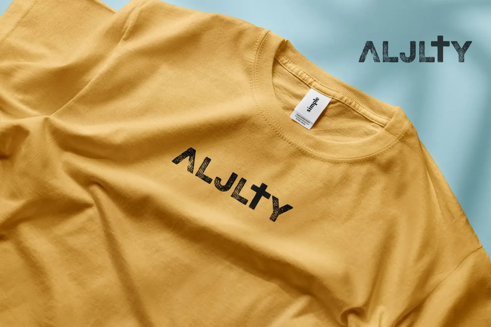
I chose the Eveleth typeface for its weight. Strong, blocky letterforms that hold up on fabric. The distressed texture treatment was Elizabeth and Brenton’s preference from the start, and they were right. It gives the logo a screen-printed quality, like ink pushed through mesh by hand. That texture communicates “handcrafted” in a way that a perfectly clean vector never could.
![]() The finished ALJLTY wordmark. The cross lives inside the T.
The finished ALJLTY wordmark. The cross lives inside the T.
Two Logo Variants (and Why You Need Both)
The distressed “rugged” version is the primary mark. Those vertical-line textures mimic screen print mesh. It looks like something somebody made, not something a company produced. For a faith-based brand, that matters.
The “straight” variant uses clean letterforms for situations where distressed texture falls apart. Small embroidery, favicons, web headers, anything under about 80px wide. Same cross-in-T concept, just optimized so it stays legible when it shrinks.
![]() Top: rugged variant for apparel and large-format. Bottom: straight variant for digital and small-scale.
Top: rugged variant for apparel and large-format. Bottom: straight variant for digital and small-scale.
The Apparel
T-shirts in mustard gold with distressed black print. Crewneck sweaters in navy with white and heather gray with dark ink. Bucket hats. Silicone wristbands. Every piece was manufactured, photographed, and sold through the ALJLTY store.
The mustard gold was a debate. Elizabeth initially leaned toward more traditional earth tones. I pushed for mustard because it stands out on a rack without screaming, and it photographs well in Colorado’s natural light (which turned out to matter for the lifestyle shoots). She came around after seeing the first sample.
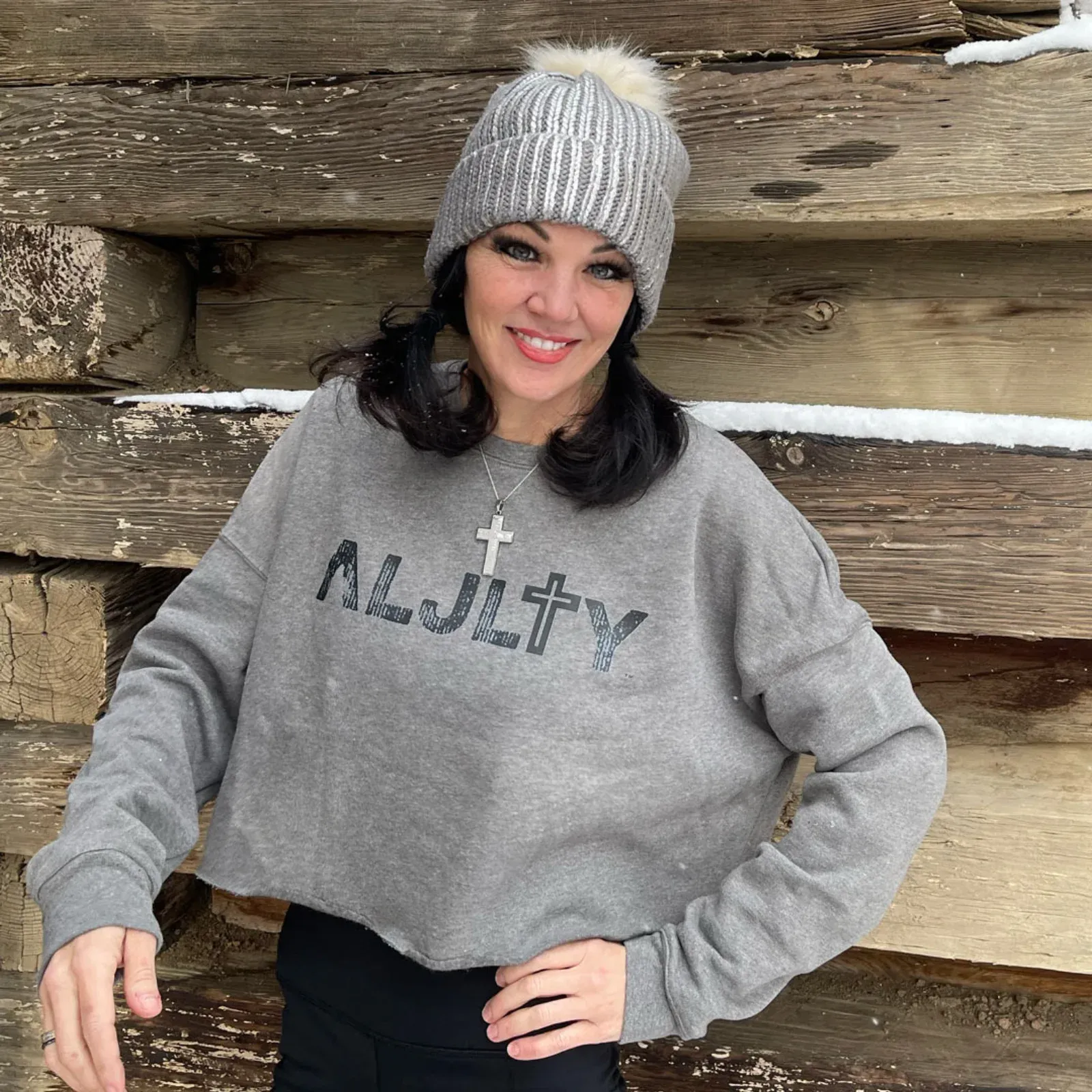 Elizabeth in the heather gray cropped crewneck. The distressed print translates well to actual fabric.
Nobody wears a t-shirt because of its theology. They wear it because it looks good and fits well. The design work only matters if the garment earns the right to be worn first. Quality blanks, colors that work in real wardrobes, print techniques that survive the wash. Then the message gets to do its job.
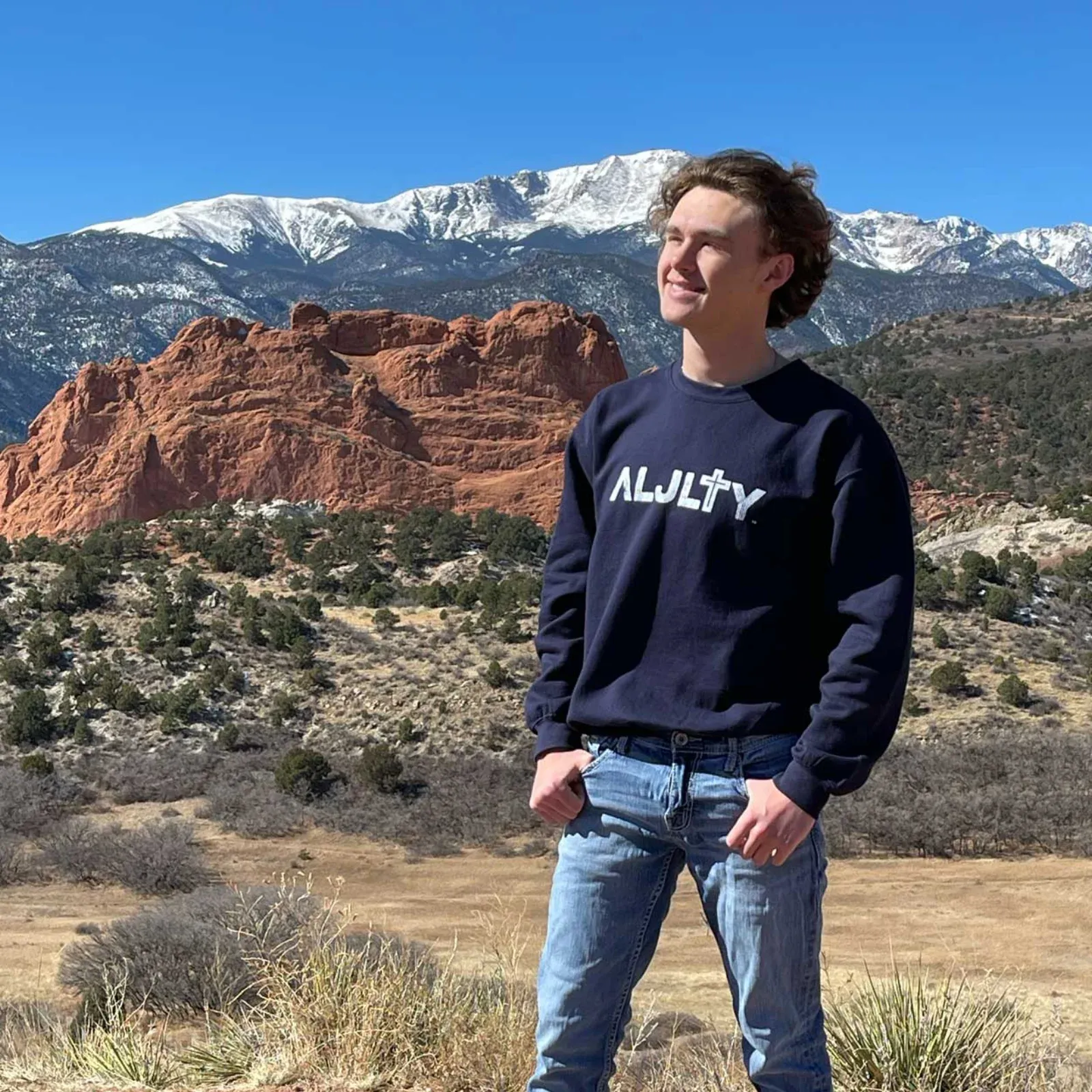 Brenton at Garden of the Gods in the navy crewneck. Colorado Springs became the backdrop for the brand photography.
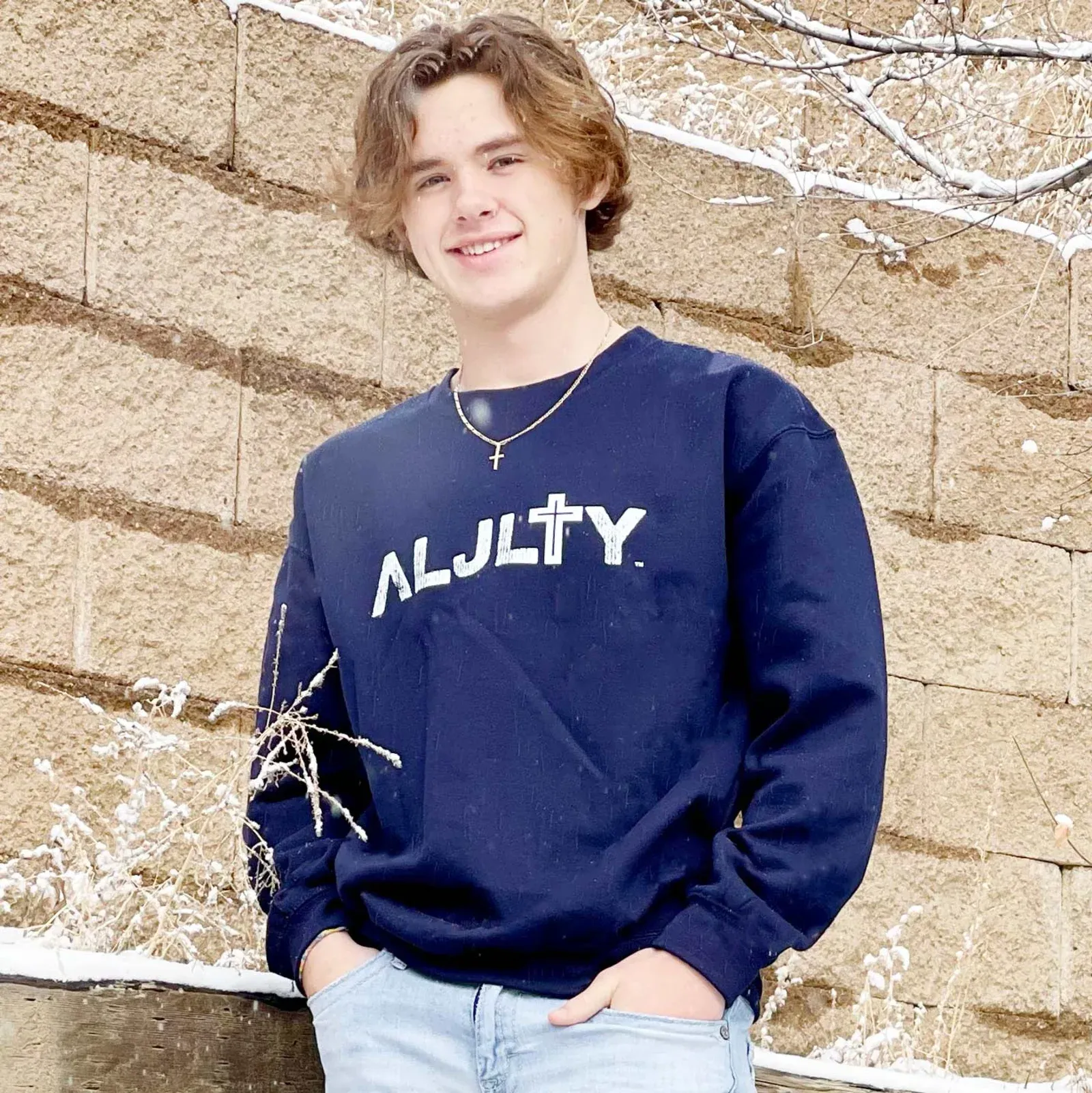 Navy crewneck with white distressed print against natural stone.
Packaging and Collateral
Every order ships with a custom package insert. Church interior as the backdrop, copper-toned ALJLTY branding, the Mark 16:15 mission statement, a coupon code (“Mark1615”), and a QR code back to the store. I wanted the unboxing to feel intentional, not like an afterthought stuffed in a poly bag.
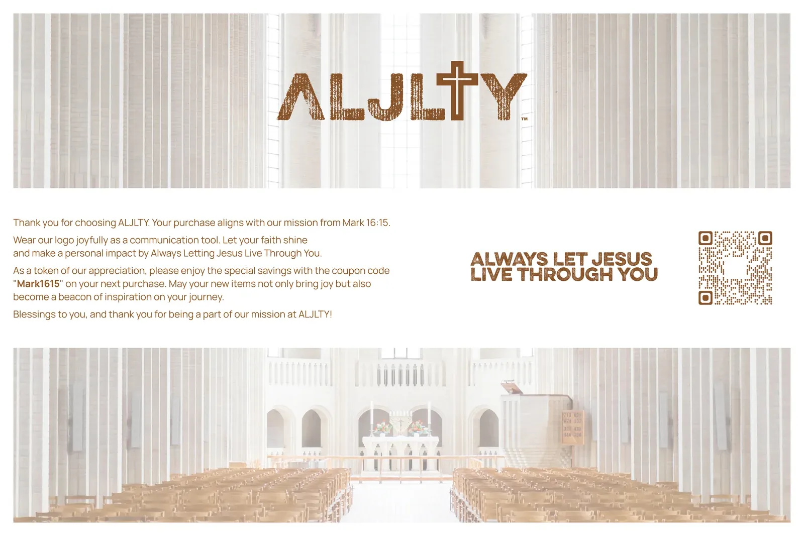 The package insert. Copper tones, church backdrop, and a built-in reason to come back.
Custom neck labels replace the generic manufacturer tags. Black and white versions match whichever garment they’re sewn into. Branded product stickers go on the outside of packaging so the brand shows up before the box is even opened.
The Store
I built the full WooCommerce store at aljlty.org. Product photography direction, descriptions, favicon, web-optimized assets. The store needed to look like a real brand from the first visit. A lot of small apparel brands launch with a bare-bones template and wonder why nobody trusts them with a credit card. The store is the storefront. It has to earn that trust.
Digital Extras
Brand wallpapers for phones and desktops. The copper ALJLTY mark over lifestyle photography: an open Bible, dried flowers, warm tones. They give customers (and the founders) something to share beyond the physical products. Small detail, but it keeps the brand visible between purchases.
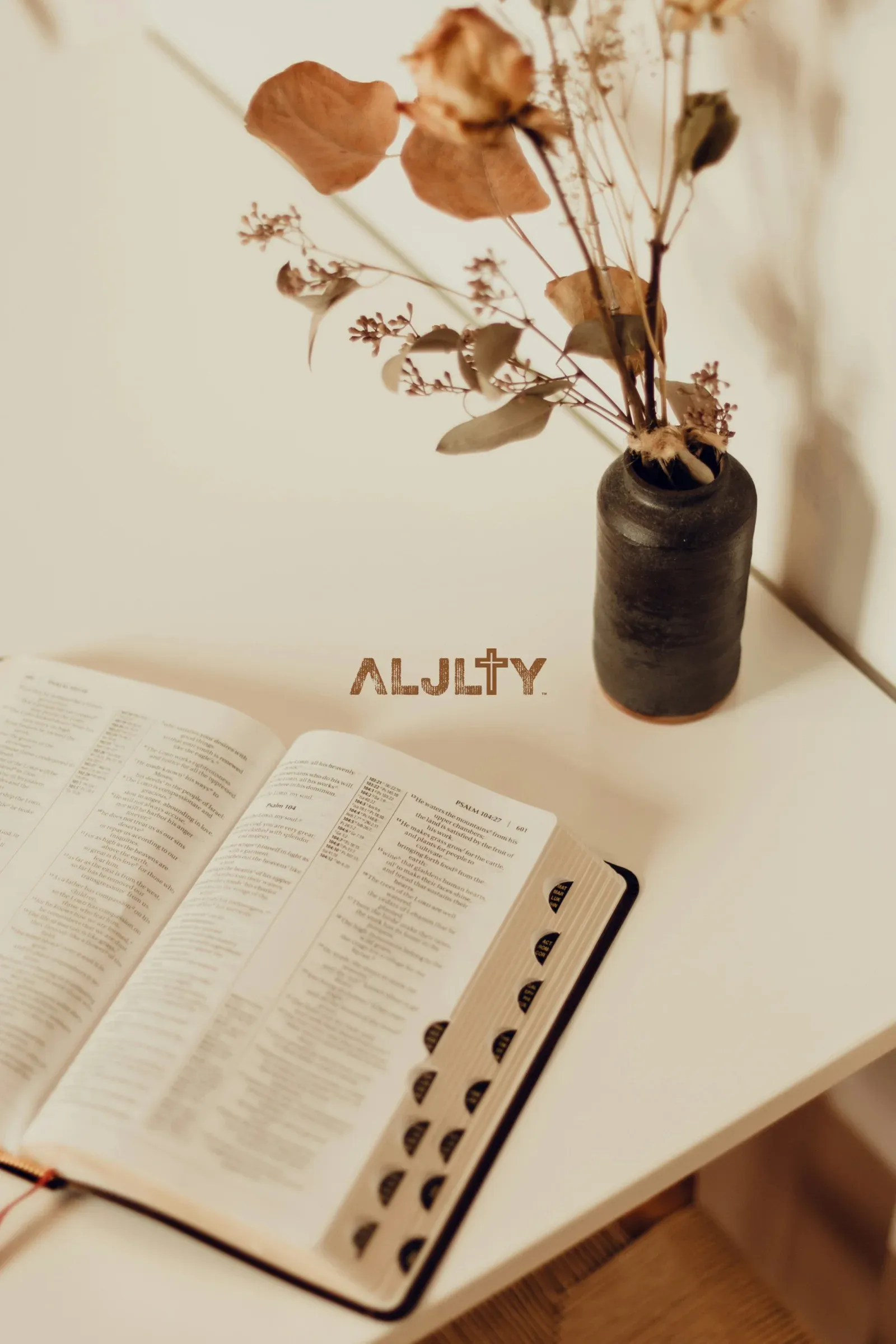 Brand wallpaper for digital distribution.
Colors and Production
The palette was built around the apparel, not the other way around. Mustard gold, navy, heather gray, black, white for garments. Copper tones for packaging and digital collateral.
Every color was tested against the actual print methods. Screen printing on cotton behaves differently than digital printing on paper. A Pantone swatch that looks perfect on screen can come out muddy on a heavy cotton blend. I spec’d the colors with production in mind because a palette that only works in Photoshop isn’t a palette.
What Came Out of It
ALJLTY went from a name and a Bible verse to a live apparel brand in 12 weeks. Logo system, manufactured products, branded packaging, WooCommerce store.
The cross-in-T does what it was designed to do. Elizabeth told me a stranger at a coffee shop asked about the logo. That’s the interaction the brand was built for. People notice, they ask, the conversation starts.
“The cross in the T was the moment everything clicked. It’s subtle, it’s intentional, and it’s exactly what ALJLTY is about.” — Elizabeth, ALJLTY / Royale Ministry
Is This Case Study Relevant to You?
This project is most useful if you:
- Are starting a brand from zero and need everything built: logo, products, packaging, online store
- Want apparel that people wear because it looks good, not because they feel obligated
- Need a brand system that works across screen printing, embroidery, woven labels, and web
- Are building a mission-driven brand where the visual identity carries meaning without being heavy-handed
Industry fit: faith-based merchandise, nonprofit product lines, clothing startups, any brand where the identity needs to speak before you explain it.
| What I Delivered | Details |
|---|---|
| Logo System | Custom wordmark with cross motif, two variants (rugged and straight) |
| Apparel Line | T-shirts, crewneck sweaters, bucket hats, silicone wristbands |
| Packaging | Package inserts, custom neck labels, product stickers |
| E-Commerce | Full WooCommerce build at aljlty.org with product photography direction |
| Brand Extras | Digital wallpapers, stock photo direction, web assets |
About Apparel Branding
Frequently Asked Questions
Your logo needs to work as a screen print, an embroidery file, a woven label, and a web graphic. Colors need to translate from Pantone to actual ink on actual fabric. I design with production in mind from day one so nothing gets lost between the mockup and the finished garment.
Yes. ALJLTY had no logo, no colors, no products when we started. I built the full brand identity, designed the apparel line, created packaging, and set up the e-commerce store. Starting from zero simplifies things because there are no legacy decisions to work around.
Design the garment first, add meaning second. People buy clothing because it looks good and fits well, not because of the message. With ALJLTY, the cross is embedded in the typography. It's there for people who notice it, but the shirt works on its own.
For ALJLTY: package inserts with a church backdrop and copper branding, custom neck labels in black and white variants, branded product stickers. Every touchpoint between opening the package and putting on the garment reinforces who made it and why.
Yes. I built ALJLTY's WooCommerce store including product photography direction, descriptions, and web-optimized assets. I also work with Shopify depending on what fits your situation.
A project at this scope (logo, apparel, packaging, e-commerce) runs 8 to 12 weeks from discovery to launch. Manufacturing lead times and feedback turnaround are the biggest variables. Simpler product lines move faster.
Not Ready Yet?
No pressure. Here’s how to tell when it’s time.
You probably need brand help if:
- You have a concept but no visual identity to bring it to market
- Your current apparel looks homemade compared to the brands you admire
- People can’t identify your products without being told who made them
- Your packaging doesn’t match the quality of what’s inside
- Your online store feels like a side project, not a destination
Think through before we talk:
- What’s the story behind your brand, and how should it look?
- Who wears your stuff, and what other brands do they buy?
- How many products are in your first run, and what manufacturing methods will you use?
- Do you need the full build, or just one piece done right?
When the timing is right:
I’m happy to have an honest conversation about whether a brand identity project makes sense for where you are. Some brands need everything built from scratch. Others just need one piece refined. I’ll tell you which.
Case study by
Kristian Kreaktive
Founder & Lead Strategist at Digital Marketing Services
17+ years of experience helping small businesses grow their online presence through strategic SEO, web design, and branding.
More Digital Marketing Clients from Colorado Springs
 Featured
How a CPA Firm Captured 991 Top-3 Google Rankings and 175 AI Overview Citations
991 keywords in top 3, 175 AI Overview citations

Product Photography for Simple Body: 2,500+ Images Across 16 Months of Seasonal Campaigns
2,500+ professional images across 75+ products and 16 months of seasonal campaigns
 Featured
How a Forced Name Change Became the Best Thing That Happened to a Colorado Springs Epoxy Company
From invisible online to #1 across a 25-mile radius, fully booked, and expanding into commercial
More Branding Success Stories
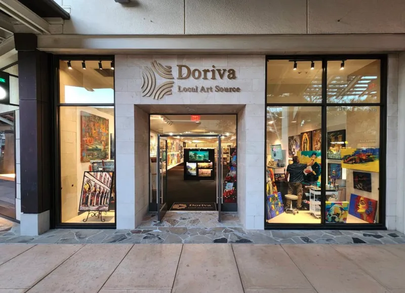
Brand Identity for a San Antonio Art Marketplace
From zero brand to 250+ organic keywords and #1 rankings for San Antonio art searches
When the Logo Tells the Whole Story: Clean Cut Renovations
One logo concept that expanded into a complete brand identity and custom website

How 50 Monthly Searches Turned Into a Fully Booked Consulting Business
From zero online presence to fully booked in 6 months, zero ad spend