Mobile SEO: How to Make Sure Your Site Works on Every Device
Google judges your website by its mobile version. If your site is slow, hard to read, or frustrating on a phone, you are being ranked on that experience. Here is how to fix it.
TL;DR
Google uses the mobile version of your website to determine your rankings, not the desktop version. If your site is slow, hard to read, or frustrating on a phone, that is what Google sees. Test your site on your actual phone (not on WiFi), fix the biggest issues first (text size, button spacing, page speed), and make your phone number a tap-to-call button.
On this page
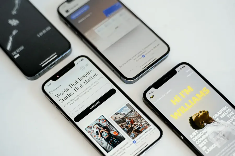
Google ranks your website based on its mobile version. Not the desktop version you probably built first. Not the version that looks good on your 27-inch monitor. The one your customers see on their phones.
This has been the rule since 2023. Google calls it mobile-first indexing, and it applies to 100% of new websites. If your site looks polished on desktop but falls apart on an iPhone, you are being ranked on the broken version.
When I audited Bristlin Construction’s site before their SEO engagement, one of the first things I checked was mobile performance. Construction companies get most of their search traffic from homeowners on phones, searching “roofer near me” while staring at a leak. Bristlin ended up with 70+ keyword rankings in 2 months, and fast mobile performance was a core part of why.
Why Mobile Performance Drives Rankings in 2026
What Mobile-First Indexing Means for Your Business
Google uses mobile-first indexing for 100% of new websites. The mobile version of your site is the primary version Google crawls, indexes, and ranks.
Here is a concrete example of what this means. If your desktop site has detailed service pages but your mobile site hides half the content behind “read more” buttons that do not work, Google sees the broken version. If your desktop site loads in 2 seconds but mobile takes 7, Google measures the 7. Your desktop experience is irrelevant to your rankings.
71% of Searches Happen on Phones
According to AIOSEO’s 2026 statistics report, mobile devices account for approximately 71% of all Google search traffic. For local searches, that percentage is even higher.
Think about your own behavior. When did you last search for a restaurant or service provider from a desktop? Most of us reach for our phones. Your customers do the same. WCG CPAs is an accounting firm, not exactly a mobile-first industry. But their site still gets heavy mobile traffic from people searching “CPA near me” or “tax help Colorado Springs” from their phones. With 991 top-3 rankings and over 3,000 pages of content, WCG proves that even professional service firms need mobile-ready sites.
How to Test If Your Site Is Mobile-Friendly
Google’s PageSpeed Insights Tool
Go to Google PageSpeed Insights, enter your URL, and toggle to the “Mobile” tab. This tool tests your site exactly the way Google sees it: performance, accessibility, best practices, and SEO, all scored separately.
Do not obsess over a perfect 100. Focus on the orange and red items. Those are the issues actually hurting your rankings.
The Real Test: Your Actual Phone
PageSpeed gives you data. But the best test is the one you can do right now. Pull out your phone, switch to cellular (not your office WiFi), and visit your own website. Time the load. Try to read the text. Try to tap a button. Try to find your phone number and call it.
If any of those tasks feel awkward, slow, or frustrating, your customers are feeling the same thing. And Google is measuring that experience when it decides where to rank you.
Core Web Vitals: Why Desktop Scores Lie
Google measures Core Web Vitals (loading speed, interactivity, visual stability) separately for mobile and desktop. Your desktop scores might look perfectly healthy while your mobile scores are failing. Always check both tabs in PageSpeed Insights.
For the full breakdown of Core Web Vitals, check out my technical SEO guide for business owners.
The Most Common Mobile SEO Problems (And How to Fix Them)
I audit dozens of websites every year. The same mobile problems show up on nearly every one. Here is what I find most often, roughly in order of how much damage they cause.
Tiny Text and Cramped Tap Targets
Pull out your phone and visit your website right now. If you have to pinch-zoom to read anything, your font size is too small. Google recommends at least 16px for body text on mobile. Most older sites use 12px or 14px, which works on a monitor but is painful on a phone screen.
The tap target issue is related. On a desktop, mouse clicks are precise. On a phone, you are using a fingertip. When I audited a client site last year, their mobile menu links were stacked 8px apart. Visitors were constantly tapping the wrong link and landing on the wrong page. The fix took 20 minutes: bump body text to 16px using relative units (rem or em), and space tap targets at least 48x48 pixels with 8px of breathing room between them. Your most important buttons, the call button, the contact form, should be even larger.
Horizontal Scrolling and Broken Layouts
When an element on your page forces horizontal scrolling on mobile, something in your responsive design is broken. I see this most often with data tables, images without max-width: 100% set, and fixed-width elements that were built for desktop and never adjusted.
Tasoro is a multi-location B2B building materials company in California. When I built their site, I made sure every product table, every spec sheet, every location page rendered cleanly on phone screens. B2B does not mean desktop-only. Their buyers browse products from job sites, warehouses, and trucks. Add max-width: 100% and overflow-x: auto to tables and images, then test every page on your actual phone.
Popups That Block the Content
Google specifically penalizes what they call “intrusive interstitials” on mobile. If a popup covers the main content the moment someone arrives from Google, it can directly hurt your rankings.
If you absolutely need a popup, make the close button large enough to tap easily, do not trigger it on page load (wait for 30 seconds or a scroll event), and keep it under 30% of the screen. Better option: replace it with a top banner on mobile. Same message, no ranking penalty.
Mobile Page Speed: The Make-or-Break Factor
The Speed Gap Between Desktop and Mobile
A page that loads in 2 seconds on your office desktop might take 6 seconds on a phone using 4G. Research from Google shows that 53% of mobile visitors leave if a page takes longer than 3 seconds to load. Those extra seconds cost you more than half your potential customers.
I build all my client sites on Astro, a framework that generates pure static HTML instead of the JavaScript-heavy approach WordPress uses. The mobile speed difference is dramatic. A typical WordPress site scores 40-60 on Google’s mobile PageSpeed test. My Astro sites consistently score 90+.
Bristlin Construction is a good example. When they came to me, speed was a priority because their customers search from job sites and driveways, always on phones, usually on spotty connections. The fast-loading site we built helped them earn 70+ keyword rankings in just 2 months. Safety Quest’s site tells a similar story: 698 organic keywords and 6 #1 rankings, built on the same mobile-first speed foundation.
Where to Start With Speed Improvements
If you are working with an existing site (not a full rebuild), these changes deliver the most improvement per hour of effort.
Images are usually the biggest problem. A 3MB hero image loads instantly on desktop but crawls on a phone. Switch to WebP format, size images appropriately (you do not need a 4000px image for a phone screen), and enable lazy loading so images below the fold only load when the user scrolls to them. On most sites, image optimization alone cuts load time in half.
JavaScript and CSS bottlenecks come next. Files that block the page from rendering are a common drag on mobile speed. Defer non-critical scripts and inline critical CSS so the browser can paint content faster.
A CDN (Content Delivery Network) helps with the last mile. It serves your site from servers closer to your visitors, which matters more for mobile users on higher-latency connections. I use Cloudflare for all my client sites, and the caching alone makes a measurable difference.
For image-heavy sites, use responsive srcset to serve different image sizes for different screens. Set explicit width and height on every image to prevent layout shifts while loading. Compress aggressively. You can usually reduce file size by 60-80% with no visible quality loss on a phone screen.
Mobile-First Design: What Actually Converts
Designing for Thumbs
Most people hold their phone with one hand and navigate with their thumb. The “thumb zone” (the area of the screen your thumb can comfortably reach) is the bottom two-thirds. That is where your primary CTA belongs: the call button, the contact form, the “get a quote” button. Bury it in a menu and most visitors never find it.
I structure every client site this way. The call button is always visible on mobile without opening any menu. On Bristlin Construction’s site, the phone number sits in a sticky header that follows you down the page. One tap, you are calling them. No searching, no scrolling back to the top.
Simplify Navigation, But Keep the Critical Actions Visible
Desktop menus with 8+ items and nested dropdowns do not work on phones. Simplify your mobile navigation to four or five essentials: your core service pages, contact info, your location, and a search function if you have a large site.
The hamburger menu is fine for secondary navigation. But the single most important action, calling your business, should be visible before anyone opens a menu. This is especially true for service businesses where phone calls are how you close deals.
Make Every Contact Path One Tap
For local businesses, three mobile-specific changes directly increase conversions.
First, your phone number should be a tel: link that opens the dialer when tapped. Not just text on the screen. An actual tappable button. Second, your address should link to Google Maps so visitors get directions in one tap. Third, location-specific CTAs outperform generic ones. “Call Our Colorado Springs Office” feels more relevant on mobile than “Contact Us” because it confirms the visitor found a local business.
A Quick Mobile Audit You Can Run Right Now
You do not need to hire anyone to check the basics. Grab your phone (on cellular, not office WiFi), pull up your website, and answer these questions honestly.
Can you read all the text without zooming? Try your homepage, your most important service page, and your contact page. If any text requires pinch-zooming, the font size needs to go up.
Can you tap the right button on the first try? Navigate around your site and pay attention to whether you hit wrong links. If buttons and links feel cramped, they need more spacing.
Does any page scroll sideways? Swipe left on every page. If content extends past the screen edge, something in your layout is broken.
Is your phone number tappable? Tap it. Does it open your phone’s dialer? If it just highlights text, you are missing the tel: link.
How fast does the site load? Count the seconds. If you get past three, you have a speed problem.
Now go to Google PageSpeed Insights, enter your URL, and tap the “Mobile” tab. Aim for 70+ as a baseline. Anything under 50 needs urgent attention.
For a complete audit beyond mobile, use my step-by-step SEO audit guide.
What a Mobile Fix Actually Looks Like in Practice
Safety Quest Limited came to me as a security training company on Long Island. Their previous site was functional on desktop but slow and clunky on phones. The content was solid, but the mobile experience pushed visitors away before they could read any of it.
I rebuilt the site with mobile as the primary design target: fast-loading static HTML, properly sized images, tappable buttons with room to breathe, and a sticky call button that follows the user down the page. The results were 698 organic keywords, 6 #1 rankings, and a pipeline that stays full because the site works where their customers actually search.
Most mobile SEO problems are fixable in a few hours. Font sizes, button spacing, image compression, page speed. These are not redesign-level changes. They are targeted fixes that produce measurable ranking improvements.
If you want to know exactly where your site stands on mobile, reach out for a free audit. I will run your site through the same tools I use for client projects and tell you what is helping and what is hurting. 30 minutes, real talk about your numbers.
For the full picture of SEO fundamentals, start with my complete SEO guide for small businesses.