The Project
NW Finish Carpentry operates across Oregon, Washington, and Idaho, specializing in hardwood flooring, custom trim work, stair installations, and cabinet systems. They’ve been at it since 2014, building a reputation for precise work that blends modern techniques with traditional carpentry methods.
But their brand didn’t reflect the quality of their work. The company needed a visual identity that could compete for high-end residential and commercial projects—something that communicated skill, reliability, and attention to detail before a client ever saw their portfolio.
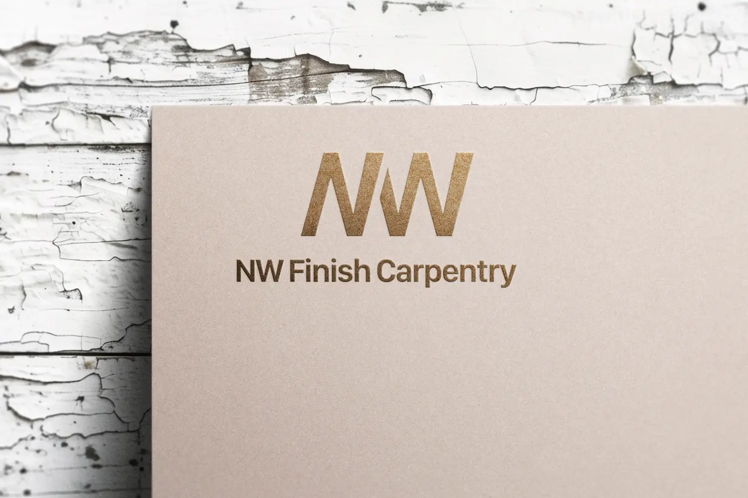
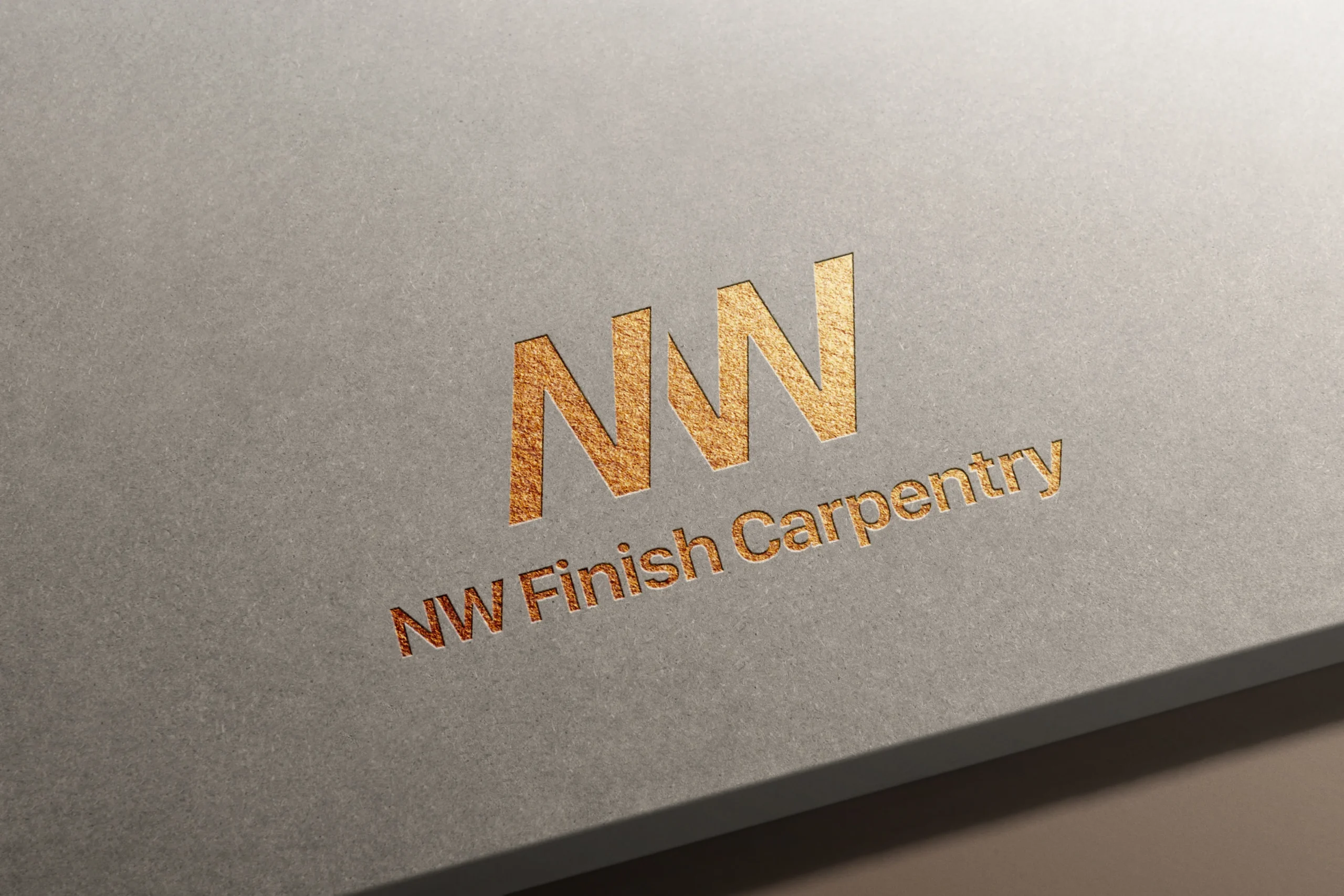
Working with ESEO SPACE, we developed a complete brand identity that positions NW Finish Carpentry as the go-to finish carpentry contractor in the Pacific Northwest. The logo itself tells their story: the N and W are designed to mimic a saw blade—a subtle nod to their craft without hitting you over the head with it.
The Company
The brand didn’t match the work. NW Finish Carpentry was delivering exceptional results on job sites, but their visual identity wasn’t opening doors to larger projects or premium clients. They looked like every other contractor.
No clear positioning in a crowded market. The Pacific Northwest has plenty of carpentry contractors. Without a distinctive brand, they were competing on price instead of expertise—despite having the skills to command premium rates.
Needed to appeal to multiple audiences. Their client base includes homeowners, interior designers, general contractors, and commercial developers. The brand had to work across all these contexts without feeling too residential or too corporate.
No foundation for growth. As they expanded services and geographic reach, they needed a brand flexible enough to scale while maintaining consistency across every touchpoint.

The Process
We started with discovery. Talking through their competitive advantages, the clients they wanted to attract, and the perception gap between their actual work and how the market saw them. What became clear was that NW Finish Carpentry’s strength wasn’t just technical skill. It was their approach: methodical, detail-focused, and rooted in both modern efficiency and traditional craftsmanship.
The brand identity needed to reflect that balance. The logo combines clean typography with that saw blade detail in the N and W. Just enough craft reference to feel authentic without being gimmicky. No cartoon hammers or overused woodgrain textures.
The color palette uses deep, natural tones that reference quality materials: rich walnut browns, charcoal grays, and warm off-whites. These colors work equally well on a residential project proposal and a commercial bid package. They communicate permanence and quality without relying on trendy design choices that’ll look dated in two years.
We created a full suite of brand assets: business cards, letterhead, proposal templates, truck wraps, job site signage, and digital graphics for their website and social channels. Each piece reinforces the same message: this is a company that sweats the details.
The brand guidelines document we delivered gives them everything they need to maintain consistency as they grow. It covers logo usage, color specifications, typography rules, and tone of voice. So whether they’re hiring a new marketing person or working with a web developer, the brand stays intact.

Work With Us
Branding isn’t decoration. It’s how potential clients decide whether you’re worth their time before they ever talk to you. For contractors, builders, and service businesses, a strong brand is the difference between competing on price and competing on value.
We build brands that position businesses for growth. Clear, confident, and grounded in what actually works. If you’re looking for a partner who understands how branding fits into your larger business strategy, check out our website design services. We integrate branding with local SEO and lead generation to build systems that grow your business.
